Free conversion audit
Get a tailored action plan based on your current funnel.
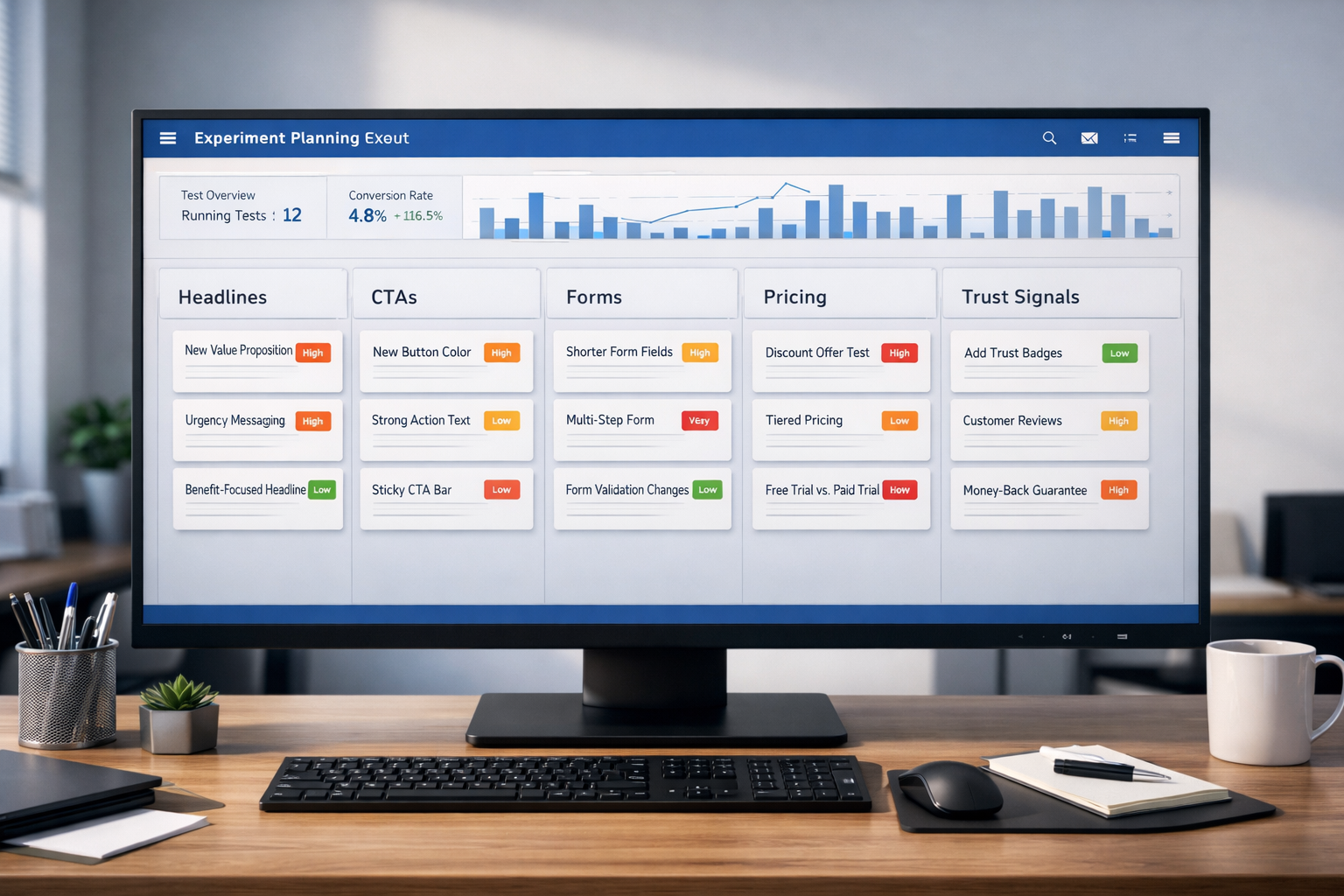
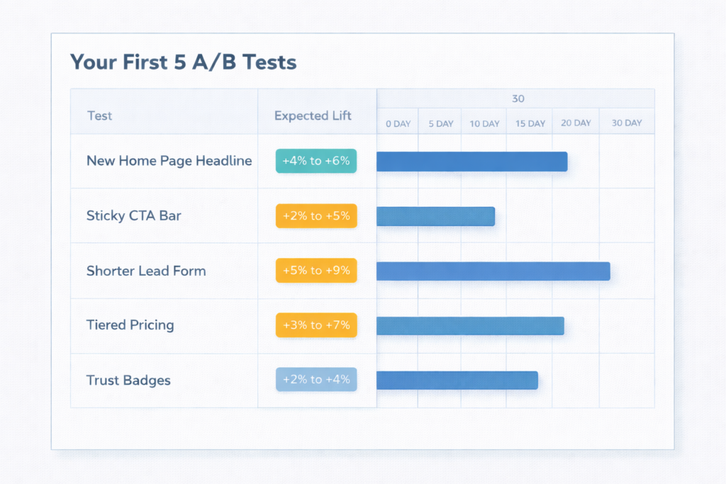
Why Every CRO Program Needs a Testing Backlog
The biggest obstacle to better conversions is not traffic, tools, or budget. It is running out of A/B testing ideas. Most teams launch two or three experiments, see mixed results, and then stall — not because testing stopped working, but because they stopped feeding the pipeline.
A stacked testing backlog changes that. When you always have five to ten prioritized experiments ready to deploy, you eliminate the gap between one test ending and the next one starting. That matters because conversion gains compound. A team that runs one test per month and averages a 5% lift per winner produces a 79.6% cumulative improvement over a year. A team that tests once a quarter gets a fraction of that.
This guide gives you 30 proven A/B testing ideas organized by page element — headlines, CTAs, forms, navigation, trust signals, pricing, and mobile UX. Each one applies to SaaS sites, service businesses, lead generation pages, and ecommerce stores. If you need the methodology behind running these tests correctly, start with our complete A/B testing guide.
How to Use This List
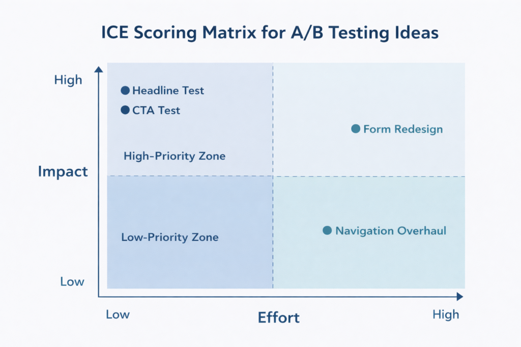
Do not run all 30 tests at once. Your traffic is your testing budget, and spreading it across too many simultaneous experiments dilutes every result. Instead, use a simple prioritization framework.
Score each idea on three dimensions — Impact (how much revenue could this move?), Confidence (how strong is the supporting evidence?), and Ease (how fast can you implement it?) — on a 1 to 10 scale. Multiply the three scores. Run the highest-scoring ideas first.
If you are not sure how long each test will take to reach statistical significance, use our A/B test calculator to estimate duration based on your traffic and baseline conversion rate. The general rule: test big changes on high-traffic pages first, save subtle tweaks for later.
Headline and Copy Ideas
Your headline is the first thing visitors evaluate and the single element most likely to determine whether they stay or bounce. These tests consistently produce the largest lifts because they change the perceived value of the entire page in one line.
1. Benefit-Led vs. Feature-Led Headline
Test a headline that leads with the outcome your customer gets (“Cut Your Monthly Churn by 18%”) against one that leads with what your product does (“AI-Powered Retention Platform for SaaS”). Benefit-led headlines outperform feature-led headlines in the majority of tests because visitors care about their problem, not your architecture.
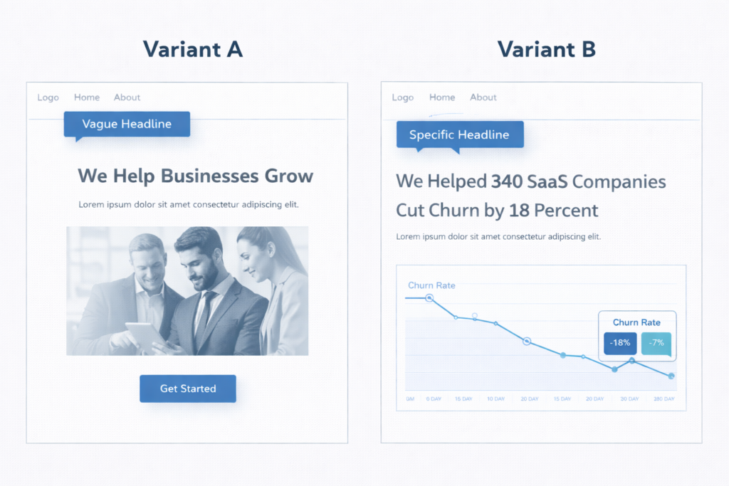
2. Specific Number vs. Vague Claim
Test a headline with a concrete data point (“340 SaaS Companies Reduced Churn by 18%”) versus a generic claim (“We Help Businesses Grow”). Specificity builds credibility. Numbers create an anchor that makes the promise feel measurable rather than aspirational. This test routinely produces 10–25% lifts in engagement metrics.
3. Question Headline vs. Statement Headline
Test a headline structured as a question (“Still Losing Subscribers to Silent Churn?”) against a direct statement (“Stop Losing Subscribers to Silent Churn”). Questions can increase engagement by triggering a mental response, but they can also create uncertainty. The right format depends on your audience’s awareness level — test it, don’t assume.
4. Customer-Voiced Headline vs. Brand-Voiced Headline
Test pulling a direct customer quote into the headline (“This Saved Our Team 12 Hours a Week”) versus your standard brand messaging. Customer-voiced headlines function as social proof and headline simultaneously. They work especially well on pages where trust is the primary conversion barrier.
5. Short Headline vs. Long Descriptive Headline
Test a tight headline (under 8 words) against a longer, more descriptive version (12–18 words) that packs in more context. Short headlines win on clarity. Long headlines win on specificity. The answer often depends on whether your visitors already understand what you sell or need education before they commit.
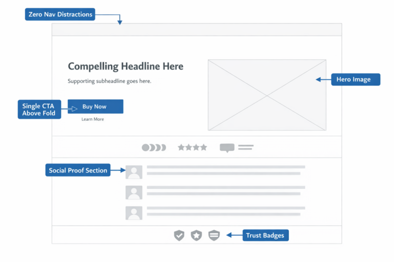
CTA and Button Ideas
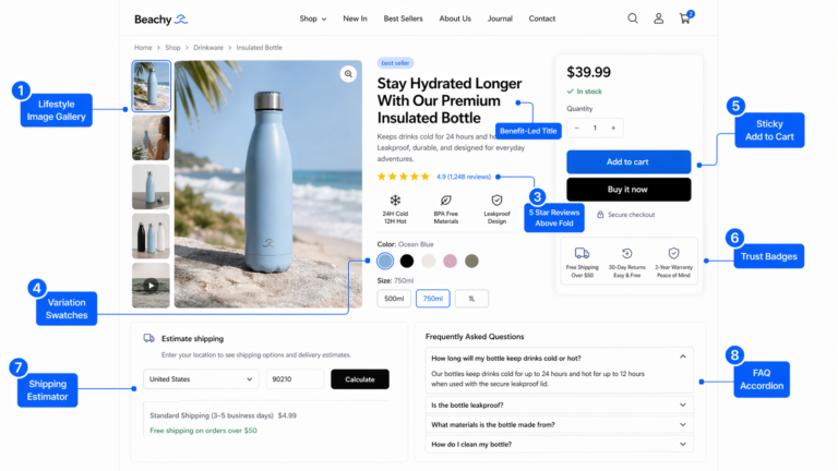
The CTA is where intention meets action. These tests target the exact moment a visitor decides to convert — or to leave. Small changes to CTA copy, placement, and design can move conversion rate by 5–15% because they directly reduce friction at the decision point.
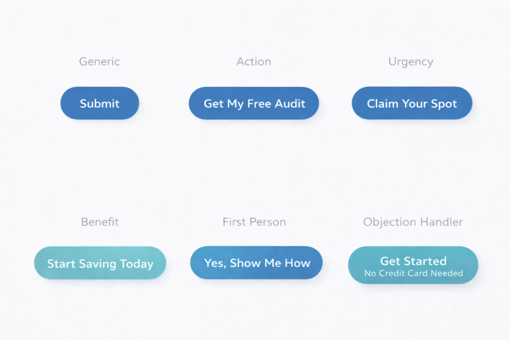
6. Action-Specific CTA vs. Generic CTA
Test replacing “Submit” or “Learn More” with copy that describes the specific action and outcome: “Get My Free Audit,” “See My Results,” or “Download the Playbook.” Generic CTAs create ambiguity about what happens next. Specific CTAs set clear expectations and reduce hesitation.
7. First-Person CTA vs. Second-Person CTA
Test “Get My Free Audit” against “Get Your Free Audit.” First-person copy (“my,” “me”) creates a subtle ownership effect — the visitor mentally claims the offer before they click. Multiple studies show first-person CTA copy can lift click-through rates by 25–90%, though the effect varies by context.
8. Single CTA vs. Dual CTA With a Low-Commitment Option
Test offering one primary CTA (“Book a Demo”) versus two options — a primary CTA and a secondary, lower-commitment action (“Watch a 2-Minute Walkthrough”). The secondary CTA captures visitors who are interested but not ready to commit. On pages with long sales cycles, dual CTAs can increase total engagement by 20–30%.
9. CTA Above the Fold Only vs. Repeated CTA After Each Section
Test a single CTA placement above the fold against repeating the CTA after every major content section. Repeated CTAs catch visitors at different stages of readiness. On long-form pages (1,500+ words), adding CTAs after persuasive sections often outperforms a single placement — especially on mobile where scrolling back up is friction.
10. CTA With Objection-Handling Microcopy vs. Button Alone
Test adding a line of microcopy directly below the CTA button — “No credit card required,” “Cancel anytime,” or “Takes 30 seconds” — versus the button alone. Microcopy answers the objection the visitor is thinking at the exact moment they hesitate. This is one of the highest-ROI tests you can run because it costs nothing to implement and typically lifts conversions by 5–12%.
Form and Lead Capture Ideas
Forms are where most lead generation funnels lose the most people. Even small friction — one extra field, unclear labeling, a wall of inputs — can cause visitors who wanted to convert to abandon. These tests target that drop-off.
11. Short Form (3 Fields) vs. Long Form (6+ Fields)
Test reducing your form to name, email, and one qualifying question versus your current multi-field version. Shorter forms almost always increase submission rate. The tradeoff is lead quality — fewer fields mean less qualification. Measure both submission rate and downstream close rate to find your optimal length.
12. Single-Step Form vs. Multi-Step Form
Test converting your single long form into a multi-step flow where each step shows 2–3 fields. Multi-step forms reduce perceived effort through progressive disclosure — the visitor commits to “Step 1 of 3” instead of facing all 8 fields at once. This test commonly lifts form completions by 15–25% on lead generation pages.
13. Inline Form vs. Click-to-Reveal Modal
Test having the form visible on the page by default versus hiding it behind a CTA button that opens a modal or slides out a panel. Modals can increase conversion by adding a micro-commitment step — clicking the button is a small “yes” that primes the visitor to complete the form. Test this especially on pages with heavy above-the-fold content where the form competes for visual space.
14. Placeholder Text vs. Floating Labels vs. Top-Aligned Labels
Test different form label patterns. Placeholder-only text disappears when the user starts typing, which creates a memory burden. Floating labels (that animate from placeholder to label position) preserve context without adding visual clutter. Top-aligned labels are the clearest but take more vertical space. On mobile, floating labels tend to outperform — test to confirm for your audience.
15. Form With Progress Indicator vs. Form Without
On multi-step forms, test adding a visible progress bar (Step 2 of 3) versus no progress context. Progress indicators reduce uncertainty and increase completion because visitors can see the finish line. The effect is strongest on forms with more than three steps, where abandonment from fatigue is highest.
Navigation and Layout Ideas
Layout and navigation changes affect every visitor on every page. These tests tend to have a smaller per-page lift than headline or CTA tests, but they scale across your entire site — making their cumulative impact significant.
16. Sticky Navigation Bar vs. Standard Navigation
Test a navigation bar that stays fixed at the top of the viewport as the user scrolls versus one that scrolls away. Sticky navigation keeps the primary CTA and menu items accessible at all times. On long pages, this can increase CTA clicks by 8–15% because the action is always one click away.
17. Minimal Navigation on Landing Pages vs. Full Site Navigation
Test removing the full site navigation from your landing pages and replacing it with just a logo and CTA button. Full navigation gives visitors exit paths that compete with your conversion goal. Simplified navigation focuses attention. On paid traffic landing pages, this test often lifts conversion by 10–20%.
18. Long-Form Page vs. Tabbed or Accordion Layout
Test whether your content performs better as a single long scroll versus an interactive layout where sections are collapsed into tabs or accordions. Long-form pages expose more content to natural scrollers. Tabbed layouts reduce overwhelm and let visitors self-select the information they care about. The winner often splits by device — long-form tends to win on mobile, tabs on desktop.
19. Hero Section: Image vs. Video vs. Interactive Demo
Test a static hero image against an autoplay background video or an embedded interactive product demo. Video can increase time on page and emotional engagement, but it can also slow load times and distract from the CTA. Interactive demos let visitors experience the product before committing. Measure both engagement rate and CTA click-through — higher engagement without higher conversion is a vanity win.
20. Content Order: Problem-First vs. Solution-First
Test whether your page should lead with the customer’s pain point (“67% of SaaS companies struggle with involuntary churn”) or jump straight to the solution (“Reduce involuntary churn by 18% in 90 days”). Problem-first builds empathy and urgency. Solution-first gets to the value faster. Test this on your highest-traffic pages where the opening section drives the most drop-off.
Social Proof and Trust Signal Ideas
Trust is the invisible conversion filter. Visitors who believe your claims convert. Visitors who doubt them leave. These tests put your credibility in front of visitors at the moments where doubt is highest.
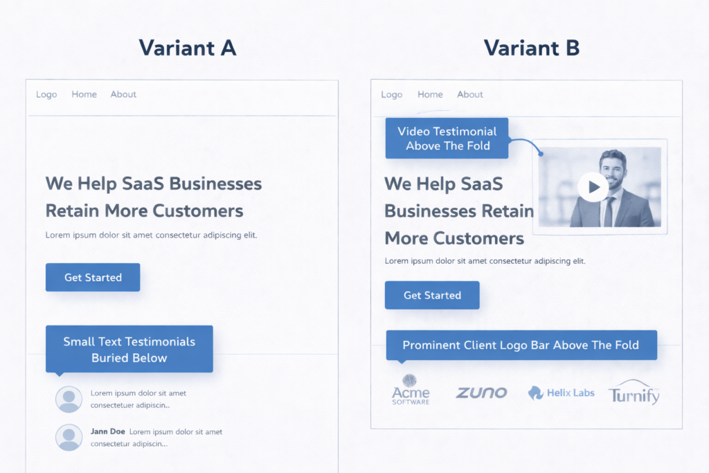
21. Text Testimonials vs. Video Testimonials
Test a section of written customer quotes against embedded video testimonials. Video testimonials are harder to fake, more emotionally compelling, and more memorable — but they also require more attention from the visitor. On pages with high-intent visitors (pricing, checkout, demo request), video testimonials consistently outperform text.
22. Client Logo Bar: Above the Fold vs. Mid-Page vs. No Logo Bar
Test the placement of your client logo bar. Above the fold establishes credibility before the visitor reads a word. Mid-page reinforces trust after the pitch. No logo bar eliminates a section that may not be doing any work. If your clients are recognizable brands, above-the-fold placement almost always wins. If your logos are unknown, test removing them entirely — they can actually hurt credibility by making your client base look unimpressive.
23. Review Count and Star Rating Near the CTA vs. Separate Reviews Section
Test placing a compact social proof badge (e.g., “Rated 4.9/5 from 430 reviews”) directly next to or below your CTA button versus keeping reviews in a dedicated section lower on the page. Proximity matters — social proof is most effective when it appears at the decision point, not three scrolls away. This is one of the highest-performing tests for both product pages and service pages alike.
24. Third-Party Trust Badges vs. Self-Stated Claims
Test displaying recognized third-party badges (BBB, Trustpilot rating, industry certification logos, security seals) versus stating the same claims in your own copy (“100% Satisfaction Guaranteed”). Third-party badges transfer the credibility of the issuing authority to your page. Self-stated claims depend entirely on how much the visitor already trusts you. On first-visit conversions, third-party badges typically win.
25. Case Study Teaser on Landing Page vs. No Case Study
Test adding a brief case study snippet — a one-line result, the client name, and a “Read the full story” link — directly on your landing page versus omitting it. Case study teasers give skeptical visitors a concrete proof point without requiring them to leave the page. The most effective format is a single metric with context: “How [Client] increased qualified leads by 41% in 90 days.”
Pricing and Offer Presentation Ideas
Pricing page tests carry the highest revenue-per-test potential because they directly influence the purchase decision and average deal value. Get these right and every visitor to your pricing page is worth more.
26. Monthly Price vs. Annual Price Shown by Default
Test whether your pricing table defaults to monthly pricing or annual pricing. Showing annual pricing first anchors the visitor to the lower per-month cost and encourages longer commitments. Showing monthly pricing first lowers the perceived entry barrier. The right default depends on your sales cycle and churn profile — test it with revenue per visitor as the primary metric, not just plan selections.
27. Decoy Pricing: Three Tiers With a Highlighted “Most Popular” vs. Two Tiers
Test adding a third pricing tier that makes your target tier look like the best deal. This is the decoy effect (asymmetric dominance) — when a clearly inferior option makes the mid-tier appear more valuable. Highlight the target plan with a “Most Popular” badge. This test frequently shifts plan distribution by 15–25% toward the highlighted tier.
28. Price Anchored to ROI vs. Raw Price
Test framing your price in terms of return on investment (“$299/month → averages $4,100/month in recovered revenue”) versus showing the raw dollar amount alone. ROI framing shifts the mental model from cost to investment. This is especially effective for B2B services and SaaS tools where the output value is quantifiable.
Mobile-Specific Ideas
More than 60% of web traffic comes from mobile devices, yet most A/B tests are designed on desktop and only checked on mobile as an afterthought. These tests target behaviors unique to small screens and touch interfaces.
29. Sticky Mobile CTA Bar vs. Inline CTA Only
Test adding a persistent CTA bar at the bottom of the mobile viewport that stays visible as the user scrolls versus relying on inline CTAs embedded in the page. Sticky mobile CTAs eliminate the need to scroll back and give every visitor one-tap access to the conversion action. On mobile lead gen pages, sticky CTAs commonly lift conversions by 8–15%. Just make sure the bar does not obscure critical content.
30. Tap-to-Call Button vs. Form on Mobile
For service businesses, test replacing the mobile lead form with a prominent click-to-call button — or offering both. Many mobile users prefer calling over typing on a small screen, especially for high-consideration services like legal, medical, home improvement, or financial planning. Measure total conversions (calls + form fills) to see whether the tap-to-call option increases overall lead volume.
Bonus: Ideas That Combine Multiple Elements
Once you have run through single-element tests, consider multi-element experiments that test a fundamentally different page strategy. These are not multivariate tests — they are variant-level redesigns built on the insights from your previous wins.
- Long-form landing page vs. short-form landing page. After you have optimized individual elements, test whether a comprehensive page outperforms a stripped-down version with only the headline, three bullet points, social proof, and CTA. Short pages win for impulse-level offers. Long pages win for high-consideration decisions.
- Video sales letter page vs. traditional copy page. Test replacing your standard text-and-image layout with a video-first page where the primary content is delivered via a 2–4 minute video above the fold. This works well for offers that benefit from storytelling and personality.
- Personalized hero based on traffic source vs. generic hero. Test dynamically changing the headline and hero image based on where the visitor came from — Google Ads sees one message, organic search sees another, email traffic sees a third. Dynamic personalization can lift conversions by 20–40% because it matches the page to the visitor’s intent.
What to Do When a Test Loses
A losing test is not a failure — it is a data point that eliminates a hypothesis and sharpens your next experiment. The value of conversion rate optimization comes from the program, not any individual test.
When a test loses, ask three questions:
- Was the hypothesis wrong, or was the execution weak? A good idea with a poor variation design can lose. Review the variation with fresh eyes before discarding the hypothesis.
- Did the test run long enough? If it did not reach 95% statistical significance, you did not get a definitive answer. That is an inconclusive result, not a loss.
- What did the segments reveal? A test that lost overall might have won on mobile, or for new visitors, or for a specific traffic source. Segment-level insights often seed the next high-confidence test.
The best testing programs treat losses as fuel. Every experiment — win or lose — adds to your understanding of what your specific audience values, fears, and responds to. That accumulated knowledge is what separates a team that guesses from a team that compounds.
Frequently Asked Questions
How many A/B testing ideas should I have in my backlog?
Aim for 10 to 15 prioritized ideas at any given time. That gives you enough runway to always have the next test ready when the current one concludes, without bloating your backlog with ideas you will never run.
What should I A/B test first on my website?
Start with the page that has the highest traffic and the clearest drop-off in your funnel. On that page, test the element closest to the conversion action — usually the headline, CTA, or form. Bottom-of-funnel tests produce revenue impact fastest.
How long should I run an A/B test?
Run every test for a minimum of two full weeks to capture weekday and weekend behavior at least twice. Use an A/B test duration calculator to confirm your specific traffic level supports reaching 95% statistical significance within that timeframe.
Can I run multiple A/B tests at the same time?
Yes, but only if the tests are on different pages or target different audience segments. Running two tests on the same page creates interaction effects that make it impossible to isolate which change caused the result.
What if I do not have enough traffic to A/B test?
If a test would take more than 8 weeks to reach significance, your page does not have enough traffic for traditional split testing. Instead, implement best practices based on CRO research and user testing, then test only your highest-confidence hypotheses on pages with sufficient volume. If your conversion rate is already low, fix the fundamentals before investing in experimentation.
Turn These Ideas Into Revenue
A list of A/B testing ideas is only valuable if you actually run them. Pick the three highest-impact experiments from this list, score them with ICE, confirm you have the traffic to test them, and launch the first one this week.
If you want help identifying which tests are worth running on your specific site — and the projected revenue impact of each — that is exactly what a free CRO audit delivers. We will analyze your funnel, flag the highest-value opportunities, and build a prioritized testing roadmap so you stop guessing and start compounding.
Already know you need a dedicated testing partner? Learn how to choose an A/B testing agency that runs experiments tied to revenue, not vanity metrics.