Free conversion audit
Get a tailored action plan based on your current funnel.
Your Shopify Landing Pages Are Quietly Killing Your Conversion Rate
You are paying for traffic. Every ad click, every email open, every social post that sends a visitor to your Shopify store costs you something — money, time, or both. And when that visitor arrives on a page that was not built to convert them, you lose the investment before the page finishes loading.
Most Shopify merchants send paid and organic traffic to pages that were never designed with a single conversion goal in mind. Homepages. Collection pages. Product pages built for browsing, not buying. The traffic arrives with intent. The page fails to capture it.
Shopify landing page optimization is the practice of designing destination pages around a single conversion objective — aligned to the traffic source, stripped of distractions, and built to move the visitor toward one specific action. It is the highest-leverage CRO work you can do, because it sits at the exact point where traffic becomes revenue or waste.
This guide covers the specific elements, techniques, and frameworks that separate high-converting Shopify landing pages from the ones that quietly bleed your ad budget dry.
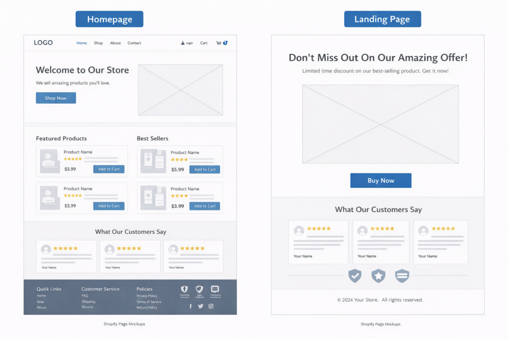
What Makes a Shopify Landing Page Different from a Product Page
A product page and a landing page serve fundamentally different purposes. Understanding this distinction is what separates stores that convert paid traffic profitably from stores that wonder why their ROAS never improves.
A product page is part of your store’s catalog. It sits within your navigation, links to related products, and is designed to serve any visitor regardless of how they arrived. It exists within the context of your full store. A well-optimized product page converts browsers into buyers — but it tries to serve everyone.
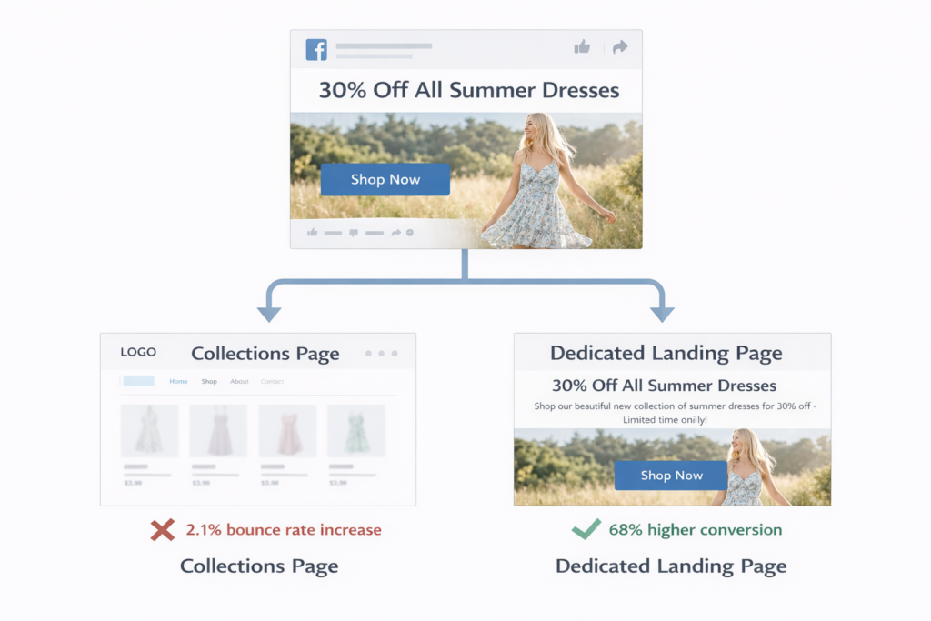
A landing page is different. It is designed for a specific traffic source with a specific intent. A visitor who clicked a Facebook ad promoting 30% off summer dresses should land on a page that shows summer dresses at 30% off — not your homepage, not your full collections page, and not a product page for a different category. The headline matches the ad. The offer matches the promise. Everything on the page supports one action.
Product pages have navigation bars, related product carousels, collection links, and breadcrumbs. Landing pages strip all of that away. A product page is an aisle in your store. A landing page has one job and removes everything else.
Why Most Shopify Landing Pages Fail
Landing page failure on Shopify typically comes from one of three problems, and most stores have all three.
Problem 1: No landing page at all. The majority of Shopify stores running paid ads send click traffic directly to existing pages — homepage, collection, or product. None of these were designed with message-match in mind. The visitor who clicked an ad with a specific promise lands on a generic page that does not reinforce that promise. Conversion drops before they scroll.
Problem 2: The page tries to do too much. Even stores that build dedicated landing pages often fill them with multiple CTAs, product carousels, navigation links, and competing sections. Every additional choice you give a visitor increases the chance they choose nothing. A landing page with three CTAs converts worse than a page with one.
Problem 3: The page is slow. Landing pages that load in over 3 seconds lose a significant portion of visitors before any content renders. If you are running paid ads, every second of load time is money evaporating from your ad spend. Speed is not a nice-to-have on a landing page. It is the baseline requirement for everything else to work. Our free website speed test shows you exactly where your pages stand.
The Message-Match Rule: One Traffic Source, One Landing Page
Message match is the single most impactful concept in landing page optimization. It means the headline, imagery, and offer on your landing page should mirror the ad, email, or link the visitor clicked to get there. The visitor’s expectation — set by the traffic source — should be immediately confirmed by the destination page.
When message match is strong, the visitor lands and thinks “this is exactly what I was looking for.” When it fails, they think “this is not what I clicked on” and bounce.
Common message-match failures on Shopify stores:
- Ad promotes a specific product at a discount → landing page shows the full collection at regular prices
- Email campaign highlights a seasonal sale → link goes to the homepage with no sale messaging visible
- Google Shopping ad features a specific SKU → landing page is a category page with 200 products in a grid
- Social post highlights a customer testimonial → landing page has zero social proof above the fold
- Retargeting ad shows the product the visitor viewed → landing page is the same product page with no additional incentive to convert
Every one of these mismatches creates friction. The visitor expected one thing and received another. Even a minor mismatch — a different headline, a different hero image — introduces doubt. Doubt lowers conversion.
The fix is straightforward: build dedicated landing pages for your top traffic sources. If you are running 5 Facebook ad sets, your top 3 by spend should each have a landing page that mirrors the ad’s headline, imagery, and offer. If you are sending email campaigns, each campaign with a different promotion should point to a page that leads with that promotion. The work is not complicated. The lift is disproportionate.
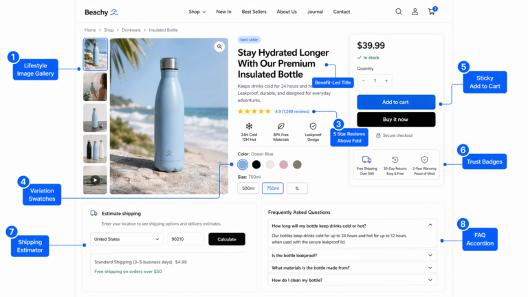
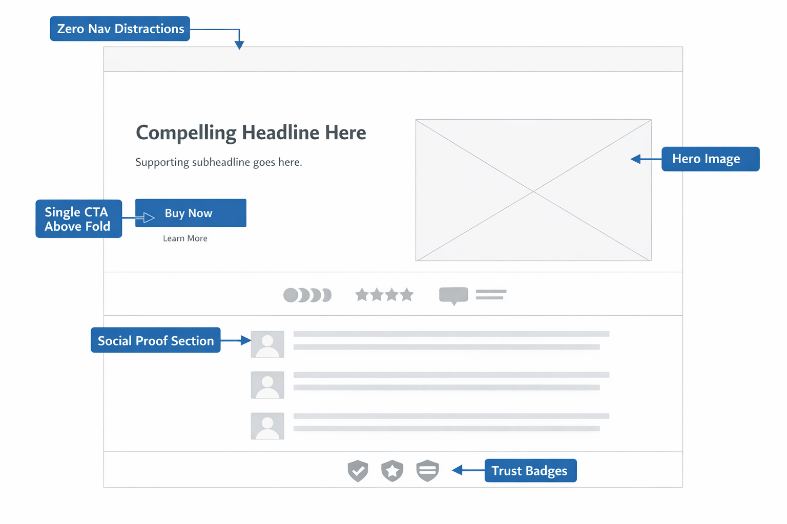
The 8 Elements of a High-Converting Shopify Landing Page
Across hundreds of Shopify stores, landing pages that consistently outperform share the same structural elements. These are not optional design choices. They are the building blocks that make conversion possible.
1. A Headline That Mirrors the Traffic Source
The headline is the first thing the visitor reads. It must confirm the promise that brought them to the page. If your ad says “50% Off Premium Candles — Today Only,” your landing page headline should reinforce that exact offer, not introduce your brand story or mission statement.
Strong landing page headlines are specific, benefit-driven, and match the language of the traffic source. Do not rewrite for creativity. Rewrite for alignment.
2. A Single Clear CTA Above the Fold
The primary call to action should be visible without scrolling on both desktop and mobile. One button, one action, one message. “Shop the Sale,” “Get 30% Off,” “Add to Cart” — whatever the conversion goal is, it should be the only action the page encourages above the fold.
Secondary CTAs below the fold are acceptable — the same action repeated, not a different one. If you find yourself adding a second competing CTA, you are building two landing pages and should split them.
3. Social Proof Within the First Two Scroll Depths
Trust is the currency that converts visitors into buyers. On a landing page — where the visitor may have never seen your brand before — social proof is how you establish it fast.
Place at least one form of social proof where it is visible quickly: review stars and count, a featured customer testimonial, logos of publications that have featured the product, or a “10,000+ customers” trust statement. The specific format matters less than the placement. If the visitor has to scroll past three sections to see that other people trust you, it is too late.
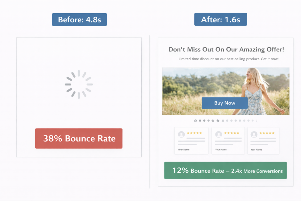
4. Page Speed Under 2 Seconds
Landing page speed has a direct, measurable impact on conversion. Every additional second of load time increases bounce rate and decreases the chance a visitor ever sees your content. For paid traffic, slow pages mean you are paying for visitors who leave before the page renders.
A Shopify landing page should target an LCP under 2 seconds on mobile. That means compressed images (WebP format, properly sized), minimal JavaScript, no autoplaying video above the fold, and as few third-party scripts as possible. Learn how to speed up your Shopify store if your current pages are not hitting this benchmark.
5. Mobile-First Layout
Over 70% of Shopify traffic comes from mobile devices. If your landing page was designed on a desktop and “made responsive” as an afterthought, mobile visitors are experiencing a degraded version of the page — and they are the majority of your audience.
Build mobile-first. Design the page on a phone-width viewport. Make sure the CTA button is thumb-reachable. Ensure images load fast on cellular connections. Use a single-column layout that does not require pinching or horizontal scrolling. On mobile, simplicity is not a tradeoff. It is the entire strategy.
6. Benefit-Led Copy, Not Feature Lists
Landing pages convert when they answer the visitor’s core question: “What does this do for me?” Features describe the product. Benefits describe the outcome the buyer cares about.
“100% organic soy wax” is a feature. “Burns 40% longer than paraffin candles, so you get more value from every purchase” is a benefit. Lead with the outcome, support with the feature. On a landing page, you have limited attention. Spend it on what the buyer actually weighs in their decision.
7. Trust Signals Before the Button
Trust signals — shipping policies, return guarantees, security badges, payment method icons — should appear in visual proximity to the CTA button. The moment a visitor considers clicking “Buy Now” or “Add to Cart,” doubt appears. Trust signals placed next to the button answer that doubt before it becomes a reason to leave.
“Free shipping over $50” next to the button. “30-day returns, no questions asked” underneath it. Visa, Mastercard, PayPal, Shop Pay icons beside the payment step. These small elements do outsized work on landing pages where the visitor has no prior relationship with your brand.
8. Zero Navigation Distractions
Remove the main navigation bar. Remove the footer links. Remove the “You may also like” carousel. A landing page is not part of your store’s browsing experience. It is a conversion tool. Every link that leads away from the page is an exit opportunity that competes with your CTA.
Shopify makes it possible to create pages with alternate templates that exclude the header and footer. Use them. The only clickable elements on your landing page should be your CTA and any trust-building content (reviews, testimonials) that supports conversion. If the visitor wants to browse your store, they will find it. Your landing page’s job is to convert, not to tour.
Shopify Landing Pages for Paid Traffic vs. Organic Traffic
Paid and organic visitors arrive with different intent, and your landing pages should reflect that difference.
Paid traffic (Facebook, Google, TikTok ads) carries a specific expectation set by the ad creative. The visitor clicked because of a specific offer, product, or message. The landing page must mirror that promise immediately. Speed matters more here because you are paying per click — every bounce is a direct cost. Message match, speed, and a single above-fold CTA are non-negotiable. If your Shopify ads are underperforming, the landing page is the first place to investigate.
Organic traffic (SEO, blog content, social shares) arrives with broader intent. The visitor searched for a solution or clicked a content recommendation. They may not be ready to buy immediately. Organic landing pages can afford slightly more educational content before the CTA — a problem/solution framework, comparison information, or a longer form social proof section. The conversion ask can be softer: “Learn more,” “See pricing,” or “Take the quiz.”
The architecture is the same — focused page, single conversion goal, fast load, clear CTA. But the pacing adjusts based on how warm the traffic is at the moment of arrival.
How to Build a Landing Page in Shopify Without an App
You do not need a page builder app to create effective landing pages in Shopify. Shopify’s native Online Store 2.0 theme architecture supports alternate page templates that work perfectly for landing page needs.
The basic approach:
- Create a custom page template in your theme that excludes the header navigation and footer, or replaces them with a minimal version (logo only, no menu links)
- Use sections and blocks to build the page content — hero with headline and CTA, social proof section, benefits section, product showcase, trust strip, and a final CTA
- Assign the template to a new page in Shopify admin under Online Store → Pages
- Set the URL path — keep it short and descriptive:
/pages/summer-sale,/pages/bundle-offer, or use a custom URL redirect to map a cleaner path
For stores on Shopify Plus, checkout extensibility and custom storefront APIs open up even more possibilities — dynamic landing pages that pull product data in real time, personalized offers based on traffic source UTM parameters, and server-rendered pages that load faster than Liquid-rendered alternatives.
If you are building landing pages for paid campaigns, plan to create one per major ad set. The extra build time pays for itself in higher conversion and lower cost per acquisition.
A/B Testing Your Shopify Landing Pages
A landing page should never be considered “done.” The first version you publish is your baseline. The goal is to iteratively test and improve it using data.
A/B testing on landing pages is more effective than almost any other page type because landing pages have a single conversion goal and a single traffic source — making it straightforward to measure whether a change helped or hurt.
The highest-impact elements to test first:
- Headline copy — the single biggest lever on any landing page. Test specificity (“30% Off All Summer Dresses”) versus benefit-framing (“Look Great This Summer for Less”)
- CTA button text — “Shop Now” versus “Get 30% Off” versus “See the Collection.” Small changes in button text produce measurable conversion differences
- Hero image — lifestyle photography versus product-only shots versus video thumbnail. The hero is the largest visual element on the page and shapes the visitor’s first impression
- Social proof placement — above the fold versus below the first section. Test whether moving reviews or testimonials higher affects add-to-cart rate
- Page length — test a short-form version (hero + CTA + trust signals) against a long-form version with additional sections. Some offers convert better with less information, not more
Run one test at a time. Wait for statistical significance before declaring a winner. And always measure the metric that matters — revenue per visitor, not just click-through rate.
Case Study: 179% Conversion Lift from a Landing Page Rebuild
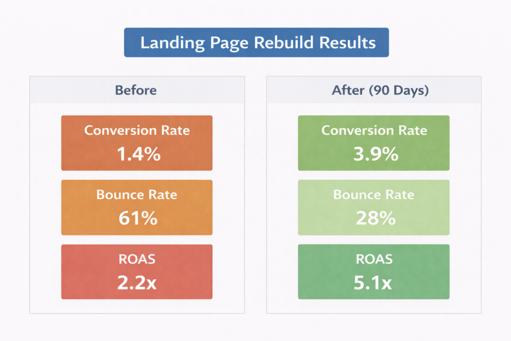
A Shopify DTC skincare brand was spending $12,000/month on Facebook and Instagram ads driving traffic to their two top-selling product pages. Conversion rate on paid traffic was 1.4% with a blended ROAS of 2.2×. The ads team had optimized creatives and targeting extensively over 4 months with no significant improvement.
A CRO audit of the paid traffic experience revealed four structural problems:
- No message match: Three different ad sets — each promoting a different offer (bundle discount, free gift with purchase, and product-specific claim) — all pointed to the same product page. The landing experience was identical regardless of which ad the visitor clicked.
- Full navigation visible: The product page included full header nav, a “You might also like” carousel, and blog links in the footer. Heatmap data showed 23% of paid visitors clicked a navigation link before ever scrolling to the Add to Cart button.
- No social proof above the fold on mobile: Reviews were loading via a third-party app below three product image carousels. On mobile, the first review was 6 scroll depths below the hero. 71% of traffic was mobile.
- Mobile LCP was 4.8 seconds: An uncompressed hero video, two unoptimized app scripts, and a font preload issue pushed the page past the 4-second mark on average mobile connections.
The fix: three dedicated landing pages were built — one per ad set — each with a headline and hero that matched the specific ad creative. Navigation was removed. A review summary (star rating + review count + one featured testimonial) was placed directly below the hero on mobile. Images were compressed, the hero video was replaced with a static WebP, and non-essential scripts were deferred.
Results over 90 days:
- Paid traffic conversion rate: 1.4% → 3.9% (179% increase)
- Bounce rate on paid landing pages: 61% → 28%
- Blended ROAS: 2.2× → 5.1×
- Monthly revenue from same ad spend: $26,400 → $61,200
No changes were made to ad creatives, targeting, or budget. The entire lift came from rebuilding the post-click experience. The ad spend stayed at $12,000/month. The revenue more than doubled.
Common Shopify Landing Page Mistakes That Kill Conversion
After auditing hundreds of Shopify landing pages, these are the errors that appear most frequently — and cost the most revenue:
- Sending all ad traffic to one page: Different ads attract different audiences with different expectations. One landing page cannot serve all of them well.
- Using the homepage as a landing page: Your homepage is designed to orient new visitors to your brand. It is not optimized for a specific conversion from a specific traffic source.
- Including navigation menus: Every navigation link on a landing page is a leak. Data consistently shows that removing navigation from landing pages increases conversion rate.
- Hiding social proof below the fold: Visitors from paid traffic often have no prior awareness of your brand. If they have to scroll past multiple sections to find evidence that real people buy from you, most will not make it.
- Ignoring mobile experience: If 70%+ of your traffic is mobile and your landing page was designed desktop-first, you are optimizing for the minority.
- Loading speed-killing apps and scripts: Page builder apps, live chat widgets, pop-up tools, and analytics scripts add up fast. On a landing page, every extra script competes with your conversion rate. Audit what is loading and remove everything non-essential.
- Testing too many things at once: Running multiple landing page changes simultaneously without proper A/B testing means you cannot attribute improvements or regressions to any specific change. One variable at a time.
How to Measure Shopify Landing Page Performance
You cannot improve what you do not measure. These are the metrics that tell you whether your landing page is working:
- Conversion rate (by traffic source): The percentage of visitors who complete the page’s intended action — add to cart, purchase, form submission. Segment by traffic source to compare paid versus organic performance.
- Bounce rate: The percentage of visitors who leave without interacting. A landing page bounce rate above 50% on paid traffic signals a message-match or speed problem.
- Revenue per visitor: More useful than conversion rate alone. A page that converts at 3% with a $40 AOV produces less per visitor than a page that converts at 2.5% with a $70 AOV.
- Cost per acquisition: For paid landing pages, divide your ad spend by the number of conversions the page produces. This is the number your entire funnel economics depend on.
- Page speed (LCP on mobile): Monitor using Site OptimizR’s speed test or Google PageSpeed Insights. If LCP is above 2.5 seconds on mobile, speed optimization should precede any other landing page work.
- Scroll depth and heatmaps: Use a session recording tool like Microsoft Clarity (free) to see how far visitors scroll and where they click. If most visitors never reach your CTA, the page structure needs to change.
Review these metrics weekly for active campaigns. Compare performance across different landing pages to identify what works and apply winning patterns to new pages. Use the CRO ROI calculator to model how conversion improvements translate to revenue.
The Compounding Value of Landing Page Optimization
Landing page optimization is not a one-time project. It is an ongoing system that compounds. Every percentage point of conversion rate improvement applies to every visitor you send to that page — this month, next month, and every month after.
If you are spending $10,000/month on ads and your landing page converts at 1.5%, a lift to 3% doubles your revenue without increasing your budget. That improvement does not expire. It does not need to be renewed. It applies to every visitor permanently until you change the page again.
This is why conversion rate optimization — and landing page work specifically — delivers the highest ROI in ecommerce marketing. You are not buying more traffic. You are making every click you already pay for twice as valuable. Combined with strong checkout optimization and reduced cart abandonment, landing pages become the front door to a conversion system that turns traffic into revenue at a rate most Shopify stores never achieve.
If you want to see where your Shopify store sits today and exactly what a conversion rate lift would mean for your revenue, start with the numbers. Our CRO ROI calculator models the impact using your actual traffic and conversion data, and it takes under 60 seconds.
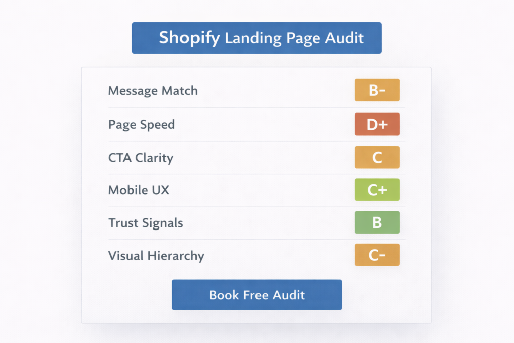
Get a Free Shopify Landing Page Audit
If you are running paid ads on Shopify and your landing pages were not purpose-built for conversion, you are almost certainly leaving revenue on the table. The gap between a generic destination page and an optimized landing page is often the difference between a 2× ROAS and a 5× ROAS — with no change in ad spend.
At Site OptimizR, our free Shopify landing page audit reviews your top paid traffic destinations for message match, page speed, mobile UX, CTA placement, social proof positioning, and trust signal visibility. You get a prioritized list of specific fixes ranked by estimated revenue impact — not a generic checklist.
Most Shopify stores we audit have 3 to 5 landing page issues that are directly suppressing conversion rate and inflating cost per acquisition. The fixes are usually implementable within 1 to 2 weeks. The lift typically shows up in your ad account within the first 30 days.
Your ad budget is already running. Make the clicks count.