Free conversion audit
Get a tailored action plan based on your current funnel.
Your Shopify Checkout Is Where Revenue Lives or Dies
Every visitor who reaches your Shopify checkout has already done the hard part. They found your store, browsed your products, and decided to buy. The only thing standing between that intent and your revenue is the checkout experience itself.
And yet most Shopify stores treat checkout as a default they never touch. That is a mistake. According to Baymard Institute, 70% of online shopping carts are abandoned, and a significant share of that abandonment happens between the cart page and the order confirmation. The checkout is the highest-leverage page on your entire store.
Shopify checkout optimization is the practice of reducing friction, building trust, and removing hesitation at the exact moment a shopper is deciding whether to hand over their money. This post covers the specific changes that actually move checkout completion rates, starting with the one most stores underestimate: trust signals.
Why Trust Signals Are the Biggest Checkout Lever
A shopper can love your product and still hesitate at the payment step. That hesitation is not about price. It is about risk. The buyer is asking themselves a set of rapid, mostly unconscious questions: Is this store real? Will I actually get what I ordered? What if I need to return it? Is my card information safe?
If your checkout does not answer those questions visually and immediately, the shopper either leaves or goes searching for reassurance elsewhere. Both outcomes cost you the sale.
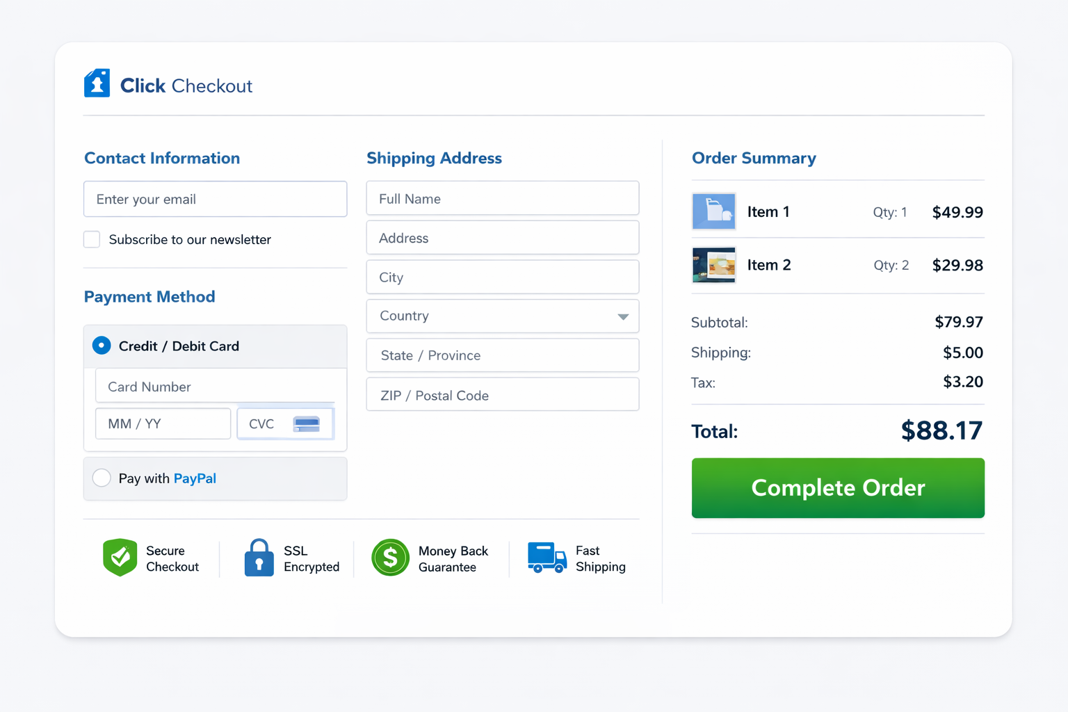
Checkout trust signals are the visual and textual cues that reduce perceived risk at the point of payment. They include security indicators, return policy language, payment method icons, delivery estimates, and proof of a real business behind the transaction. The key is not whether you have these elements somewhere on your site. It is whether they are visible at the exact moment the shopper needs them.
A trust badge buried in the footer does almost nothing. A concise return-policy line placed next to the checkout button can save the sale.
The Trust Signals That Actually Move Shopify Checkout Conversion
Not all trust signals carry equal weight. The ones that consistently impact Shopify checkout conversion rate are the ones that address the specific objection a buyer has at the payment step.
Here are the trust signals worth implementing, ranked by typical impact:
- Return and refund policy near the pay button — A single line like “Free returns within 30 days” placed within visual proximity of the checkout CTA reduces the biggest objection for first-time buyers
- Delivery estimate in plain language — “Arrives in 3–5 business days” is more effective than “standard shipping” because it tells the buyer exactly what to expect
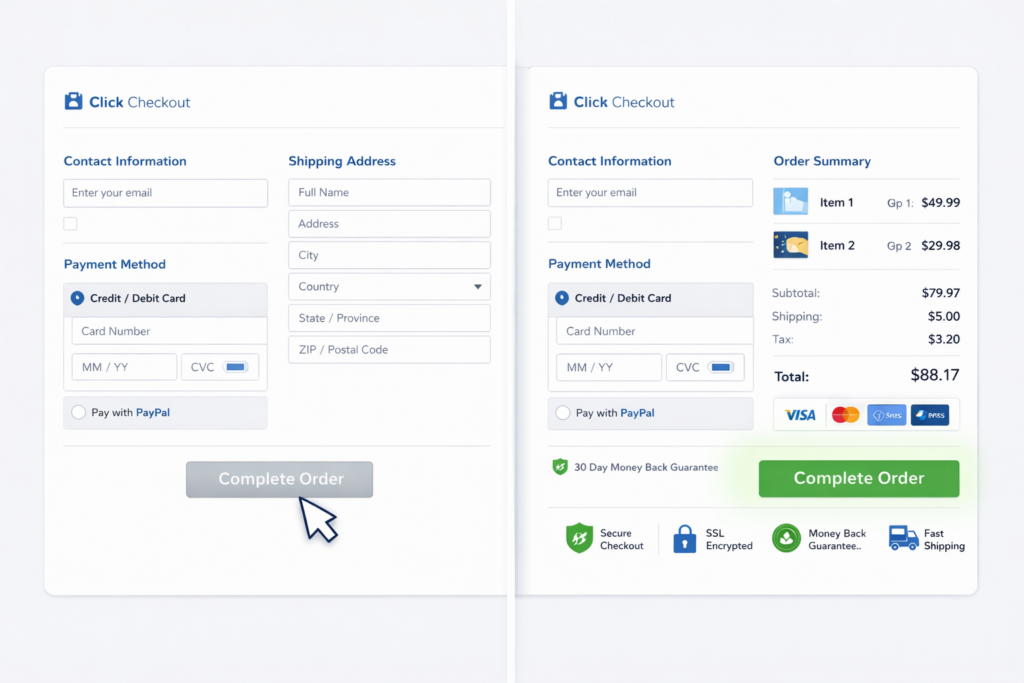
- Accepted payment icons — Visa, Mastercard, PayPal, Shop Pay, Apple Pay logos near the payment field signal that the checkout is legitimate and flexible
- Secure checkout indicator — A small lock icon or “Secure checkout” label next to the payment section reinforces that card data is protected
- Contact information or live support access — A visible phone number, email, or chat option signals that a real business stands behind the transaction
- Review count or rating summary — If the shopper sees social proof before committing, hesitation drops. This works best as a subtle summary, not a full review carousel
The common mistake is treating trust as decoration. These signals work because they answer real objections at the exact moment they arise. Place them where the friction is, not where the design has extra space.
Reduce Checkout Fields to the Minimum
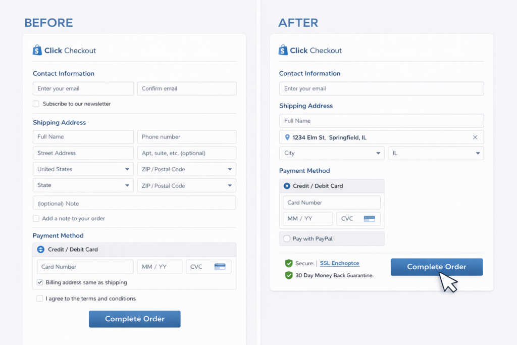
Every extra field on your Shopify checkout adds a small dose of friction. Individually, each one seems harmless. Combined, they create the kind of subtle resistance that makes a mobile shopper pause, get distracted, and never come back.
Shopify’s native checkout is already leaner than most platforms, but stores still introduce unnecessary friction through apps, custom fields, and poor configuration. The fastest way to improve Shopify checkout optimization is to audit every input and ask: does this field help complete the order right now?
Fields that should stay:
- Email or phone for order confirmation
- Shipping address with autocomplete enabled
- Payment details
Fields that often hurt conversion:
- Order note boxes that no one reads operationally
- Custom checkboxes added by apps that are not relevant to fulfillment
- Marketing opt-in toggles placed in the middle of the payment flow
- Discount code fields displayed prominently enough to trigger coupon-hunting behavior
Address autocomplete alone can cut form completion time significantly. If you have not enabled it, that is one of the highest-ROI checkout changes available on Shopify.
Fix the Discount Code Problem
The discount code field might be the most underestimated conversion killer in ecommerce. It looks innocent but creates an immediate psychological fork: the shopper sees the empty box and wonders whether someone else has a code they do not.
That thought alone is enough to cause a tab switch. The shopper leaves your checkout, searches for a coupon, gets distracted, and never returns. Your cart abandonment rate goes up, and you never see the signal in your analytics because the drop-off looks like normal behavior.
The fix depends on your business model:
- If discounts are core to your strategy, apply them automatically or via URL parameters so shoppers never need to hunt
- If discounts are occasional, collapse the code field behind a small text link instead of displaying it as a prominent input
- If you run paid ads to drive traffic, a prominent discount field actively works against your ad spend by encouraging shoppers to leave the funnel
The goal is not to remove discounts. It is to stop the code field from creating hesitation at the worst possible moment.
Optimize Shopify Checkout for Mobile First
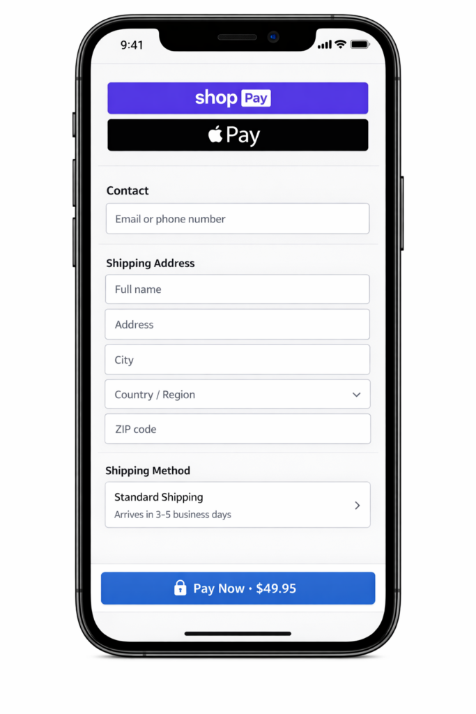
Most Shopify stores get the majority of their traffic from mobile devices, and mobile shoppers are the most likely to abandon. Smaller screens, shorter attention spans, and more interruptions mean your mobile checkout needs to be faster and simpler than desktop, not a scaled-down version of it.
The most common mobile checkout problems on Shopify:
- Checkout CTA buried below upsells, trust blocks, or cart summary sections
- Express payment buttons (Shop Pay, Apple Pay) pushed out of the initial viewport
- Tiny tap targets that require precision instead of confidence
- Keyboard behavior that covers input fields or hides error messages
- Slow checkout rendering caused by app scripts loading on every page
The highest-impact mobile fix is almost always visibility. Make the checkout action impossible to miss. On mobile, a sticky checkout button that stays anchored to the bottom of the viewport can outperform a static button buried in the page flow.
Express checkout options deserve premium placement on mobile. A shopper who can pay with a single biometric confirmation (Face ID, fingerprint) converts at dramatically higher rates than one who has to type card details on a phone keyboard. If Shop Pay or Apple Pay are available, they should be the first thing the buyer sees.
Speed Up Your Checkout Page
A slow checkout is an invisible conversion killer. The shopper does not consciously decide the page is too slow. They just feel resistance, hesitate, and leave. Google has documented that 53% of mobile users abandon pages that take longer than 3 seconds to load, and that applies to checkout just as much as landing pages.
Checkout speed problems on Shopify usually come from three sources:
- App scripts loading on checkout pages — Review, upsell, and tracking apps often inject JavaScript that was never designed for the payment flow
- Heavy theme assets — Custom fonts, animations, or oversized images that load globally including on checkout
- Third-party tracking pixels — Multiple analytics and retargeting scripts firing simultaneously during the most performance-sensitive page
The fix is audit and subtraction. Use your browser dev tools or a tool like PageSpeed Insights to measure checkout load time specifically. Then remove or defer anything that does not directly support completing the purchase. If you need help identifying what to cut, a Shopify performance audit can pinpoint the scripts dragging down your checkout.
Show Shipping Cost and Delivery Time Before Checkout
Surprise shipping costs remain the top reason shoppers abandon purchases. If a buyer reaches checkout and discovers the total is higher than expected, trust collapses instantly. Even a small unexpected fee triggers the feeling of being tricked, and that emotional response is hard to overcome.
The solution is not necessarily free shipping. It is transparency. Show delivery cost and timing before the buyer commits to the checkout flow:
- Display your free shipping threshold on the product page and in the cart
- Use a progress bar or message like “You’re $12 away from free shipping” to frame the next action
- State estimated delivery time in the cart, not just at the shipping step of checkout
- If you charge shipping, make the cost visible early enough that it is not a surprise
A store with a $7 flat shipping rate and clear messaging from the product page forward will outconvert a store with $5 shipping that only reveals it during checkout. Predictability converts better than low prices hidden until the last step.
Use Express Checkout and One-Page Checkout
The fewer steps between intent and confirmation, the higher your completion rate. Shopify has invested heavily in making this possible, and stores that take advantage of it see measurable improvement.
Shop Pay is Shopify’s native accelerated checkout. It saves buyer details across stores so returning shoppers can complete a purchase in seconds. For stores with a high percentage of Shopify ecosystem buyers, enabling and prominently displaying Shop Pay can be one of the single biggest checkout improvements.
Beyond Shop Pay, make sure you have enabled the payment methods your audience expects: Apple Pay, Google Pay, PayPal, and major credit cards at minimum. The right mix depends on geography and customer profile, but the principle is universal: reduce the effort required to pay.
If you are on Shopify Plus, one-page checkout condenses the multi-step flow into a single view. For standard Shopify plans, the three-step checkout is already optimized, but every reduction in perceived steps — like pre-filling fields, collapsing optional sections, or showing a progress indicator — helps the buyer feel closer to done.
A/B Test the Changes That Matter
Not every checkout tweak deserves a formal test. Some changes are obvious wins: enabling address autocomplete, showing a return policy near the pay button, and removing unnecessary fields should just be done.
But when you are deciding between two approaches, controlled testing avoids expensive guesswork. The checkout elements most worth testing include:
- Trust signal placement (above vs. beside vs. below the pay button)
- Express checkout button prominence (top of checkout vs. after email entry)
- Shipping threshold messaging (progress bar vs. text-only vs. no message)
- Discount code field visibility (prominent input vs. collapsed link vs. hidden)
- Mobile CTA style (sticky bottom bar vs. static inline button)
The point of testing is not to optimize button colors. It is to resolve genuine uncertainty about which trust, speed, or simplicity changes produce the largest revenue lift for your specific audience.
If your conversion rate is low across the board, fix the obvious checkout friction first. Test the marginal decisions after the foundation is solid.
Real Example: How Checkout Trust Signals Lifted Revenue 26%
A Shopify home goods store came to Site OptimizR with strong traffic and healthy add-to-cart numbers. Their checkout initiation rate looked normal, but completed purchases lagged. The gap between “reached checkout” and “order placed” was where the revenue was disappearing.
The audit found four issues:
- No return policy language appeared anywhere near the checkout CTA. Buyers had to navigate to a separate page to find it
- Shipping cost was only revealed at the final checkout step, even though the store offered free shipping over $75
- The discount code field was displayed as a large, prominent input that triggered coupon-hunting behavior
- On mobile, the Shop Pay button was pushed below three upsell suggestions and a trust badge block
The changes were targeted and took less than two weeks to implement:
- Added a one-line return policy (“Free returns within 30 days, no questions”) directly below the complete order button
- Surfaced the free shipping threshold on product pages and in the cart with a progress bar
- Collapsed the discount code field into a small “Have a code?” text link
- Moved express checkout options above the fold on mobile
Over the following 6 weeks, checkout completion rate increased by 26% and revenue per session rose by 19% with no change in traffic volume or ad spend. That is the leverage of focused conversion rate optimization: it compounds because every visitor becomes more valuable.
The Shopify Checkout Optimization Checklist
Use this as a quick reference to audit your own checkout. If you can check every item, your checkout is in strong shape. Every unchecked item is a potential source of lost revenue.
- Trust signals — Return policy, security indicator, and payment icons are visible near the pay button
- Shipping transparency — Cost and delivery estimate are shown before the checkout step
- Field count — Only fields required for fulfillment and payment are present
- Address autocomplete — Enabled and working on both desktop and mobile
- Discount code field — Collapsed or automatic, not prominently displayed
- Express checkout — Shop Pay, Apple Pay, and PayPal are enabled and visible above the fold on mobile
- Mobile UX — Checkout CTA is sticky or immediately visible without scrolling
- Page speed — Checkout loads in under 3 seconds on mobile
- Guest checkout — Enabled as the default path
- Error handling — Form errors are clear, specific, and easy to fix on a phone
Get a Free Shopify Checkout Audit
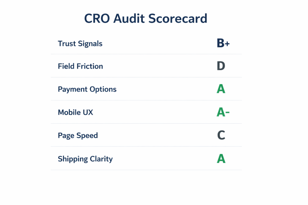
If your Shopify store gets traffic and add-to-carts but completed purchases lag, the checkout is almost always where the revenue is leaking. You do not need a full redesign. You need to know exactly where buyers hesitate and which fixes move the number fastest.
Our free Shopify checkout audit reviews your trust signals, field friction, payment options, mobile UX, page speed, and shipping clarity. You get a prioritized action plan built around impact, not guesswork.
Most stores have 3 to 5 preventable friction points in checkout costing them sales every day. If you want to turn more checkout visits into completed orders, we will show you where the drop-off starts and how to fix it.