Free conversion audit
Get a tailored action plan based on your current funnel.
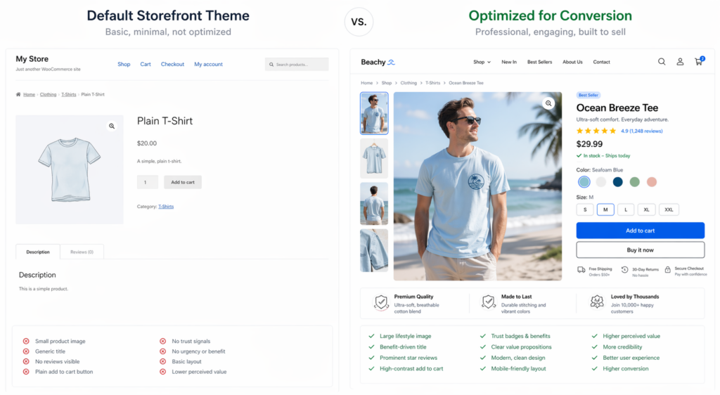
WooCommerce powers more than 28 percent of all online stores, but most of them convert at less than 1 percent. The reason is rarely the product, the price, or the traffic. It is the product page.
WooCommerce ships with a default product page that is built for compatibility with thousands of themes and plugins. It is not built to convert. Out of the box, you get a small image, a tiny gallery, dropdown variation selectors, no social proof above the fold, no trust signals near the buy button, and a generic blue “Add to Cart” link that looks like a hyperlink instead of a call to action.
The result is exactly what every store owner sees in their analytics: high traffic to product pages, low add-to-cart rate, and the assumption that the problem is somewhere else in the funnel. It is not. It is the page itself.
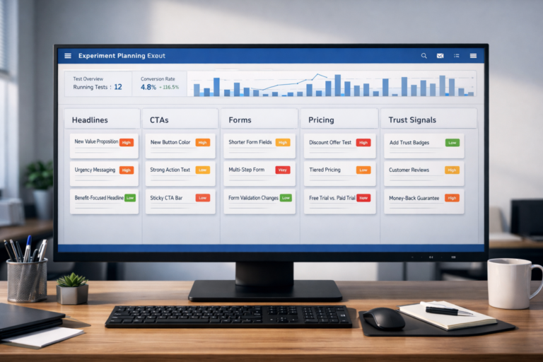
This guide walks through ten high-impact optimizations that fix the default WooCommerce product page and turn more visitors into customers. None of them require a custom theme rebuild. All of them are testable. If you are looking for the broader picture, start with our WooCommerce conversion rate optimization guide. If you run a Shopify store instead, see our companion guide on Shopify product page optimization.
Why WooCommerce Product Pages Convert Worse Than They Should
The honest answer is that WooCommerce was never designed as a conversion-first ecommerce platform. It started as a plugin layered on top of WordPress, which was designed for content publishing. Every product page you see is a WordPress post type rendered through a theme template, not a purpose-built buying interface.
This matters because the default Storefront theme is built for compatibility, not conversion. It renders correctly on every WordPress install, with every plugin, on every browser. That is a great engineering achievement and a terrible commercial one. Compatibility means lowest common denominator. Lowest common denominator on a product page means low conversion.
The good news is that every problem on the default WooCommerce product page is fixable without a custom theme. Most of these fixes can be implemented through CSS overrides, lightweight plugins, or template overrides in your child theme. The ten fixes below are ranked roughly in order of impact based on what we see consistently move conversion rates in real WooCommerce store audits.
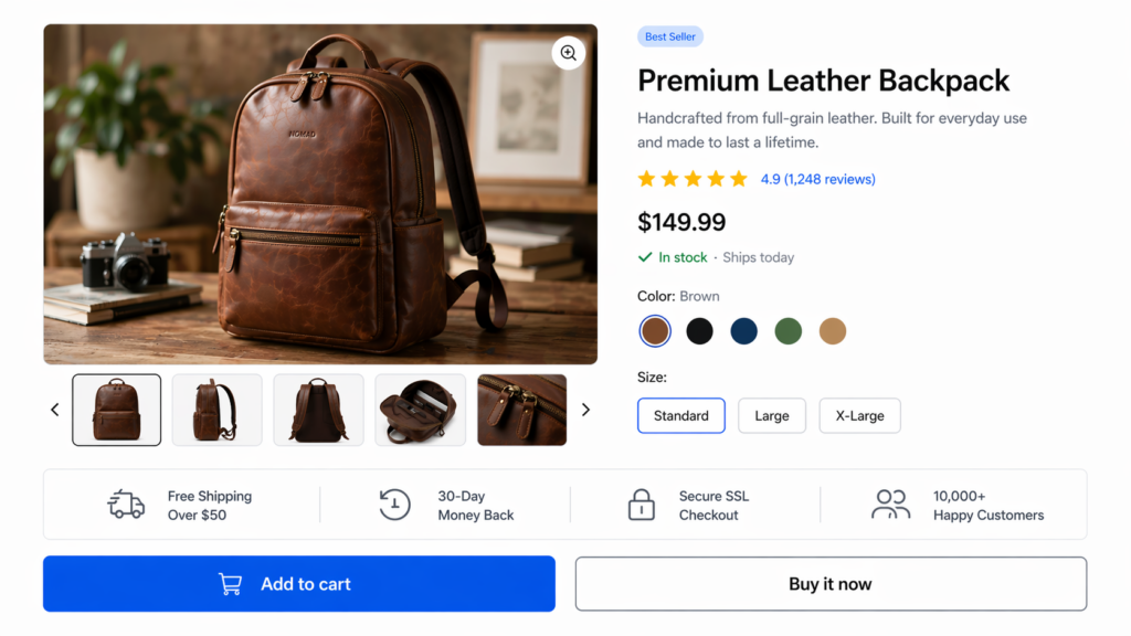
Fix #1: Replace the Tiny Default Image Gallery
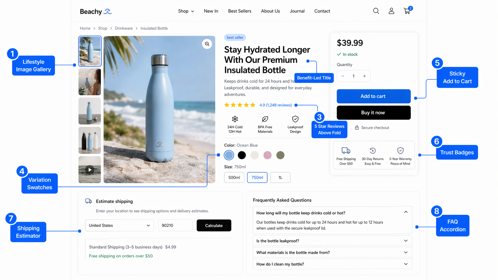
The single biggest visual problem with default WooCommerce product pages is the image. By default, the product image takes up about 35 percent of the page width on desktop, and the gallery thumbnails sit in a small row beneath it. Buyers cannot evaluate a product they cannot see properly.
Your image gallery should:
- Use a primary image at least 1200 pixels wide, displayed at minimum 50 percent of page width on desktop
- Include 5 to 8 images per product, mixing studio shots, lifestyle context, scale references, and detail close-ups
- Support hover zoom or click-to-enlarge in a lightbox
- Show alternate angles within the first scroll
- Include at least one lifestyle photograph showing the product in real use
- Optionally include a 360 degree spin or short product video for high-consideration items
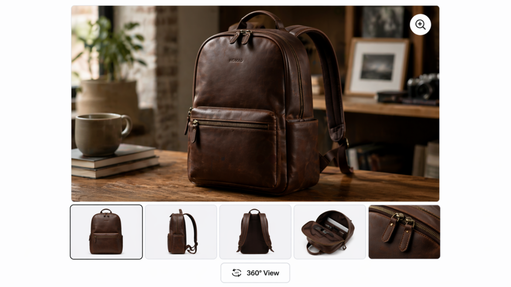
You can replace the default WooCommerce gallery using plugins like WooCommerce Product Gallery Slider or by installing a product-page-focused theme like Flatsome, Astra Pro, or Kadence. Whatever route you choose, the goal is to make the image the dominant element above the fold. Buyers decide in the first three seconds whether your product looks worth their attention. Tiny images lose that decision before the copy is even read.
Fix #2: Rewrite the Product Title to Lead With the Outcome
WooCommerce stores almost always use the SKU-style product name as the title. “Premium Leather Backpack 25L Brown” describes the product. It does not sell it.
The product title is the largest text on the page and the first thing the buyer reads. It should answer the question: what do I get and why does it matter? Compare:
- Weak: Premium Leather Backpack 25L Brown
- Strong: The Everyday Leather Backpack — Built for 10 Years of Daily Use
The strong version still includes the keyword for SEO (“leather backpack”) but adds a benefit-led promise that makes the buyer want to read more. The same logic works for any category. “Stainless Steel Water Bottle 1L” becomes “The 24-Hour Cold Water Bottle Built to Outlast Plastic.” “Organic Cotton T-Shirt White” becomes “The Organic Cotton T-Shirt You Will Reach For Every Week.”
If you cannot rewrite every title, focus on your top 20 percent of products by traffic. Those are the pages where title changes will move the most revenue.
Fix #3: Move Reviews and Star Ratings Above the Fold
WooCommerce, by default, places reviews in a tab beneath the product description. That tab gets clicked by less than 10 percent of visitors. The other 90 percent leave without ever knowing your product has 200 five-star reviews.
The fix is simple and high impact: display the star rating and review count directly below the product title, above the price. A small line of text — “★★★★★ 4.8 from 247 reviews” — is one of the strongest trust signals you can put on a page, and it costs nothing to add.
If you use a review plugin like Judge.me, Yotpo, or Stamped, all three offer “stars under title” display widgets that integrate with WooCommerce. If you use the native WooCommerce reviews, you can add the rating display via a child theme template override or a snippet in your functions.php file.
The full review section should still live below the description, but it should also be richer than the default. Show review photos, allow filtering by star rating, surface the most helpful reviews first, and respond publicly to any negative review. Buyers do not expect perfection. They expect honesty and responsiveness.
Fix #4: Replace Variation Dropdowns With Visual Swatches
The default WooCommerce variation selector is a dropdown menu. Color is a dropdown. Size is a dropdown. Material is a dropdown. Every dropdown is a click, a scan, and a decision the buyer has to make without seeing what they are choosing.
Visual swatches solve this. Show colors as colored circles. Show sizes as buttons. Show materials as small swatch tiles with the texture visible. The buyer sees their options at a glance and makes a faster, more confident choice.
Plugins like Variation Swatches for WooCommerce (free) or WooCommerce Variation Swatches by Iconic (premium) handle this with no custom code. Set up the swatches once in WooCommerce attributes and every variable product on the site converts.
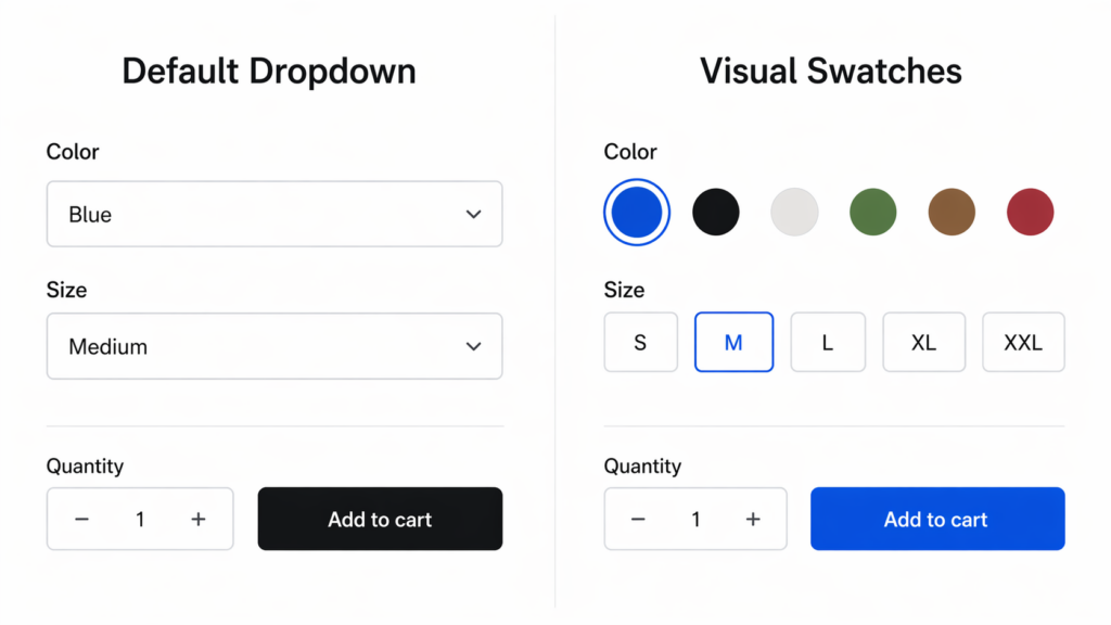
The data on this is consistent across every WooCommerce store we have audited: switching from dropdowns to swatches lifts add-to-cart rate on variable products by 8 to 22 percent. It is one of the lowest-effort, highest-return changes you can make.
Fix #5: Make the Add to Cart Button Look Like a Button
The default WooCommerce “Add to Cart” button is small, low contrast, and styled to match whatever your theme decided was acceptable. On many themes it is a thin blue link. On others it is a gray rectangle that disappears against the page background. On Storefront default, it is a desaturated purple.
The CTA button is the most important visual element on the page. Treat it accordingly:
- Make it large — at least 50 pixels tall on desktop, 56 pixels on mobile
- Use a high-contrast color that does not appear anywhere else on the page
- Use action-oriented copy: “Add to Cart — $49” beats “Add to Cart” alone because price-anchored CTAs convert better
- Add a subtle hover state and pressed state for tactile feedback
- Consider a microinteraction (small bounce or checkmark) on click for confirmation
If you sell a high-consideration product, add a secondary “Save for Later” or “Wishlist” button beside the primary CTA. Some buyers are not ready to buy on the first visit but will return if they can save the product without creating an account. WooCommerce wishlist plugins handle this well and recover meaningful revenue.
Fix #6: Add a Sticky Add to Cart Bar
On long product pages — and most should be long — the buyer scrolls past the original add-to-cart button while reading the description, reviews, and FAQs. By the time they decide to buy, the button is hundreds of pixels above. Many buyers simply leave.
A sticky add-to-cart bar that appears once the user scrolls past the primary buy box keeps the buying decision one click away at all times. The bar should include:
- Product name (truncated if long)
- Variant selectors if multiple variations exist
- Quantity selector
- Price
- The same primary CTA button as above the fold
On mobile, this becomes even more critical because vertical screen space is limited. A sticky bottom bar with price and CTA is now the standard expectation on every mobile ecommerce site, and WooCommerce stores that lack it consistently convert worse on mobile.
Plugins like Sticky Add to Cart for WooCommerce or YITH WooCommerce Sticky Add to Cart implement this with no custom code. If your theme already supports it, enable it.
Fix #7: Fix the Mobile Product Page
More than 65 percent of WooCommerce traffic is now mobile. Most WooCommerce themes were designed mobile-responsive, not mobile-first, and the difference shows. Default mobile product pages on WooCommerce are full of friction:
- Image gallery is stacked but small and cannot be pinched to zoom on most themes
- Variation dropdowns are tiny and tap-targets fail iOS accessibility guidelines
- Quantity stepper is too small to tap accurately
- Add to Cart button sits below the description, requiring a long scroll
- Trust badges and shipping info are buried in tabs that mobile users rarely open
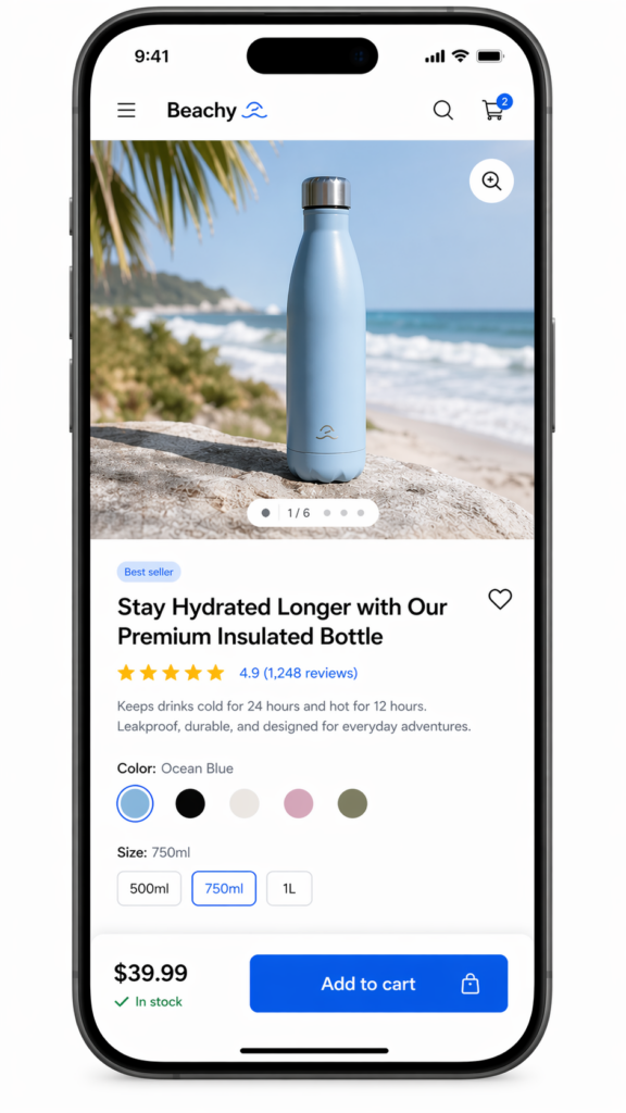
The mobile product page should be redesigned, not just shrunk. Image gallery should fill screen width and support pinch zoom. Variation selectors should be large tap targets with visual swatches. Quantity stepper buttons should be at least 44 pixels square. Add to cart should be sticky at the bottom of the screen at all times. Critical trust signals should be visible without opening any accordion or tab.
If your store gets meaningful mobile traffic and you have not specifically tested the mobile product page recently, you are almost certainly losing revenue. Run the page through your phone, attempt a purchase as if you were a customer for the first time, and note every moment of friction. Each one is a fix.
Fix #8: Add a Shipping Estimator and Delivery Date
One of the most common reasons buyers abandon a WooCommerce product page is uncertainty about shipping cost and delivery time. They do not want to add the product to their cart, fill in their address at checkout, and only then discover that shipping is $14 or that delivery takes 9 to 14 business days.
Show shipping cost and estimated delivery date on the product page itself. Two formats work well:
- Postal code estimator: “Enter your ZIP for a delivery estimate” — calculates cost and date based on cart and shipping zone
- Geo-IP delivery date: detects the buyer’s location and shows “Order in the next 4 hours, get it by Thursday May 8”
Plugins like Advanced Shipping Estimator for WooCommerce, WooCommerce Estimated Delivery Date, or WPC Estimated Delivery Date handle both patterns. The combination of shipping cost transparency and a specific delivery date does two things: it removes anxiety and it creates urgency. Both lift conversion.
If you offer free shipping above a threshold, surface that on the product page too: “Add $12 more for free shipping” near the add-to-cart button is one of the highest-converting messages you can show on an ecommerce site.
Fix #9: Add Trust Signals Near the Buy Button
Default WooCommerce shows the add-to-cart button in isolation. No security badge, no return policy, no shipping promise, no money-back guarantee. Buyers click “Add to Cart” with zero reassurance about what happens next.
Add a trust bar directly below or beside the buy button. Effective trust signals include:
- Free shipping promise (if applicable, with threshold)
- Money-back guarantee window (30 days, 60 days, lifetime)
- Secure SSL checkout badge
- Payment method icons (Visa, Mastercard, PayPal, Apple Pay, Klarna)
- Customer count: “Trusted by 12,000+ customers”
- Industry certifications relevant to your category (organic, fair trade, FDA, etc.)
- Press mentions or “as seen in” logos
Trust signals are most effective when they are specific. “Trusted by thousands” is forgettable. “Trusted by 12,847 buyers in 38 countries” is credible. “Free shipping” is fine. “Free shipping on US orders over $50, dispatched within 24 hours” is much better.
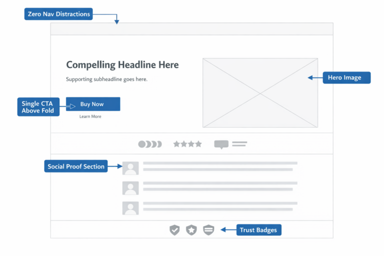
Fix #10: Replace the Description Tab With a Long-Form Page Layout
The default WooCommerce product page hides the description, additional information, and reviews behind tabs. Tabs were a 2012 design pattern. They no longer fit how buyers shop in 2026.
The modern high-converting product page is one long, scrollable page. It tells a story from top to bottom: hero image and CTA at the top, then benefits, then features, then social proof, then FAQs, then technical details, then reviews. The buyer scrolls in one direction and absorbs information in the order you choose.
This works for several reasons:
- SEO benefits: long-form product pages rank better because they contain more relevant content per URL
- Mobile-friendly: scrolling is natural on mobile, tab-clicking is friction
- Storytelling: you control the order of information instead of letting the buyer randomize it
- Trust building: every section is an opportunity to address an objection
To rebuild your product page as long-form, you can use Elementor Pro, Bricks Builder, or any modern WooCommerce-compatible page builder that lets you template the single product page. Replace the default tabs with sectioned content blocks. Keep the original tabs available for SEO benefit but make the long-form scroll experience the primary path.
How to Test These Changes Without Breaking Your Store
Every change in this list is testable. Do not roll out all ten at once. Roll them out in priority order, measure each one, and keep what works.
The basic testing protocol:
- Establish a baseline conversion rate for your top product pages over the last 30 days
- Implement one change at a time, ideally on a single product or category first
- Run an A/B test for at least 2 weeks or until you reach 95 percent statistical significance
- If the test wins, roll out to all products in that category, then site-wide
- If the test loses or is flat, revert and move to the next priority
For WooCommerce, A/B testing tools like Nelio AB Testing, Convert.com, or Google Optimize alternatives work natively with WordPress. If you are new to testing, our guide on A/B testing fundamentals covers how to design and read tests properly. Our companion guide on ecommerce A/B testing covers the specific tests that move revenue.
The order we recommend rolling out the fixes above:
- Variation swatches (Fix #4) — fastest implementation, highest typical lift
- Reviews above the fold (Fix #3) — small change, large trust signal impact
- Mobile sticky add to cart (Fix #6) — recovers mobile revenue immediately
- Trust signals near buy button (Fix #9) — quick to implement, addresses common objections
- Image gallery upgrade (Fix #1) — bigger lift but more design work involved
- Title rewrites (Fix #2) — only on top-traffic products first
- CTA button redesign (Fix #5) — pairs well with theme-level styling refresh
- Shipping estimator (Fix #8) — requires plugin selection and zone configuration
- Mobile product page rebuild (Fix #7) — biggest impact but largest scope
- Long-form layout (Fix #10) — requires page builder commitment
What to Measure
Three numbers tell you whether your product page optimizations are working:
- Add to Cart Rate: percentage of product page sessions that result in an add to cart. The single most direct measure of product page effectiveness
- Product Page to Purchase Rate: percentage of product page sessions that result in a completed purchase. Captures both PDP and downstream conversion
- Average Order Value: changes in AOV signal whether buyers are reaching cross-sells, bundles, and upgrade prompts on the page
Track all three weekly during the optimization period. If add-to-cart rate goes up but purchase rate stays flat, the leak has moved downstream and you should look at WooCommerce checkout optimization and WooCommerce cart abandonment next.
The Pages That Deserve Your Attention First
You probably have hundreds of product pages. You will not optimize all of them at once. Use this priority order:
- Top 20 percent by sessions: these pages drive 80 percent of your traffic. Every conversion improvement compounds
- Top 10 percent by revenue: these pages already convert. Lifting them another 10 to 20 percent is high-leverage
- High-traffic, low-conversion outliers: pages with above-average sessions but below-average conversion rate are the highest-ROI optimization targets — they have demand but lose buyers
- New product launches: apply the optimized template from day one rather than retrofitting later
If you are not sure where to start, pull a Google Analytics 4 product report and sort by sessions. Look at the top 20 products. Most stores will find that 5 to 8 of them carry the entire revenue line. Start there.
The Larger Pattern
WooCommerce product page optimization is not about cosmetic improvements. It is about removing the assumptions that ship with the default platform — that buyers will tolerate small images, hunt for reviews in tabs, decode dropdown menus, and find shipping costs three steps later in checkout. They will not. They will leave, and they will not come back.
Every fix in this guide is a removal of friction. None of them require a custom theme rebuild. None of them require six months of development. All of them are reversible if a test loses. And all of them compound: each fix individually moves conversion rate by a small percentage, but stacked they routinely double or triple add-to-cart rate on the pages that get them.
If you have a low conversion rate on your WooCommerce store and have already optimized your checkout and cart abandonment flows, the product page is almost certainly where the remaining revenue is hiding.
If you want a second set of eyes on your product pages and a prioritized list of the changes that will move your specific store, book a free CRO audit. We will review your top 20 product pages, identify the highest-impact fixes for your category, and give you the exact rollout order.
Your product page is the page where the buyer decides. Make sure the page is built to win that decision.