Free conversion audit
Get a tailored action plan based on your current funnel.
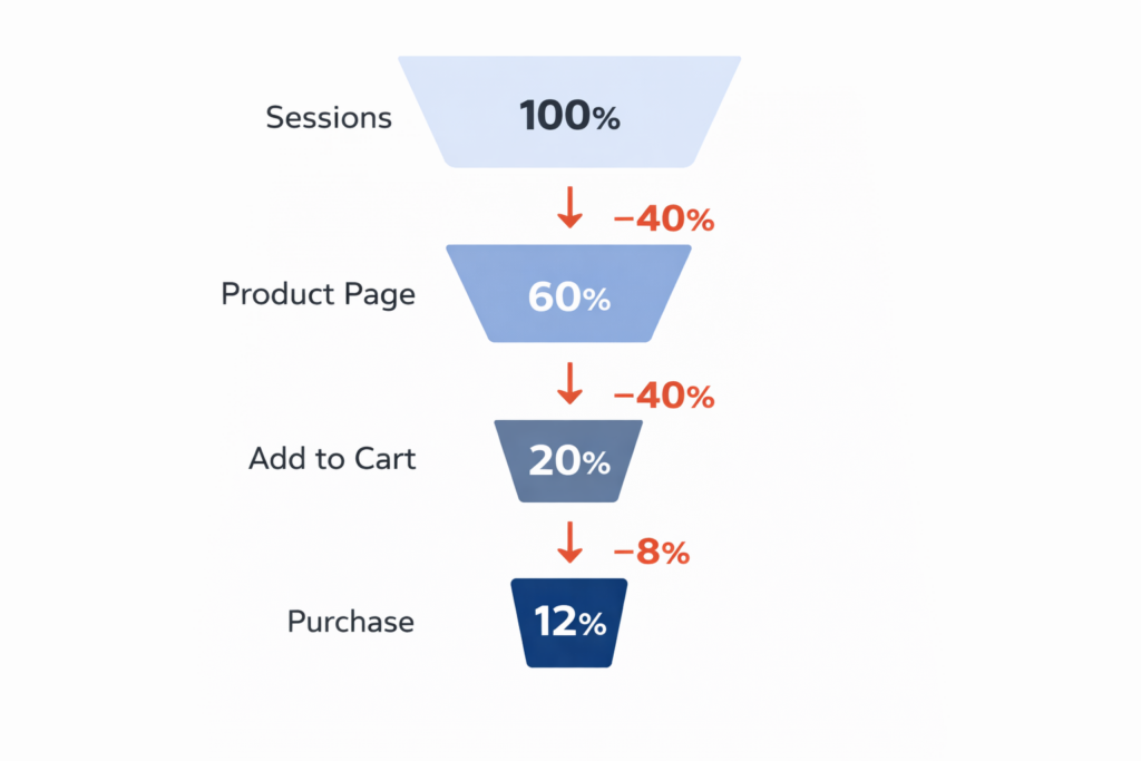
Your Product Page Is Where Most Shopify Sales Are Lost
Most Shopify store owners focus their conversion efforts on checkout. That is too late. By the time a shopper reaches checkout, they have already made the most important decision: whether they want the product. That decision happens on the product page, and most Shopify stores are fumbling it.
Product pages are responsible for more lost revenue than any other part of the buying journey. A visitor lands on your page, does not see what they need to feel confident, and leaves. They do not add to cart. They do not reach checkout. They are just gone. If your store is getting traffic but not converting, the product page is the first place to look.
This guide covers the 10 highest-impact Shopify product page optimizations you can make right now — prioritized by the revenue they typically recover. These are not design opinions. They are friction removals backed by what consistently moves Shopify conversion rates in the real world.
Why Most Shopify Product Pages Fail to Convert
The typical Shopify product page fails not because it looks bad, but because it does not answer the questions buyers need answered before they commit. Shoppers arrive with a set of silent questions: Does this product do what I need? Is this worth the price? Will it arrive in time? Can I return it if it is wrong? What do other people think of it?
When the page does not answer those questions quickly and clearly, the default action is to leave. No friction, no argument — just a closed tab. That is where most Shopify stores hemorrhage revenue every single day.
The fixes below address each failure mode directly.
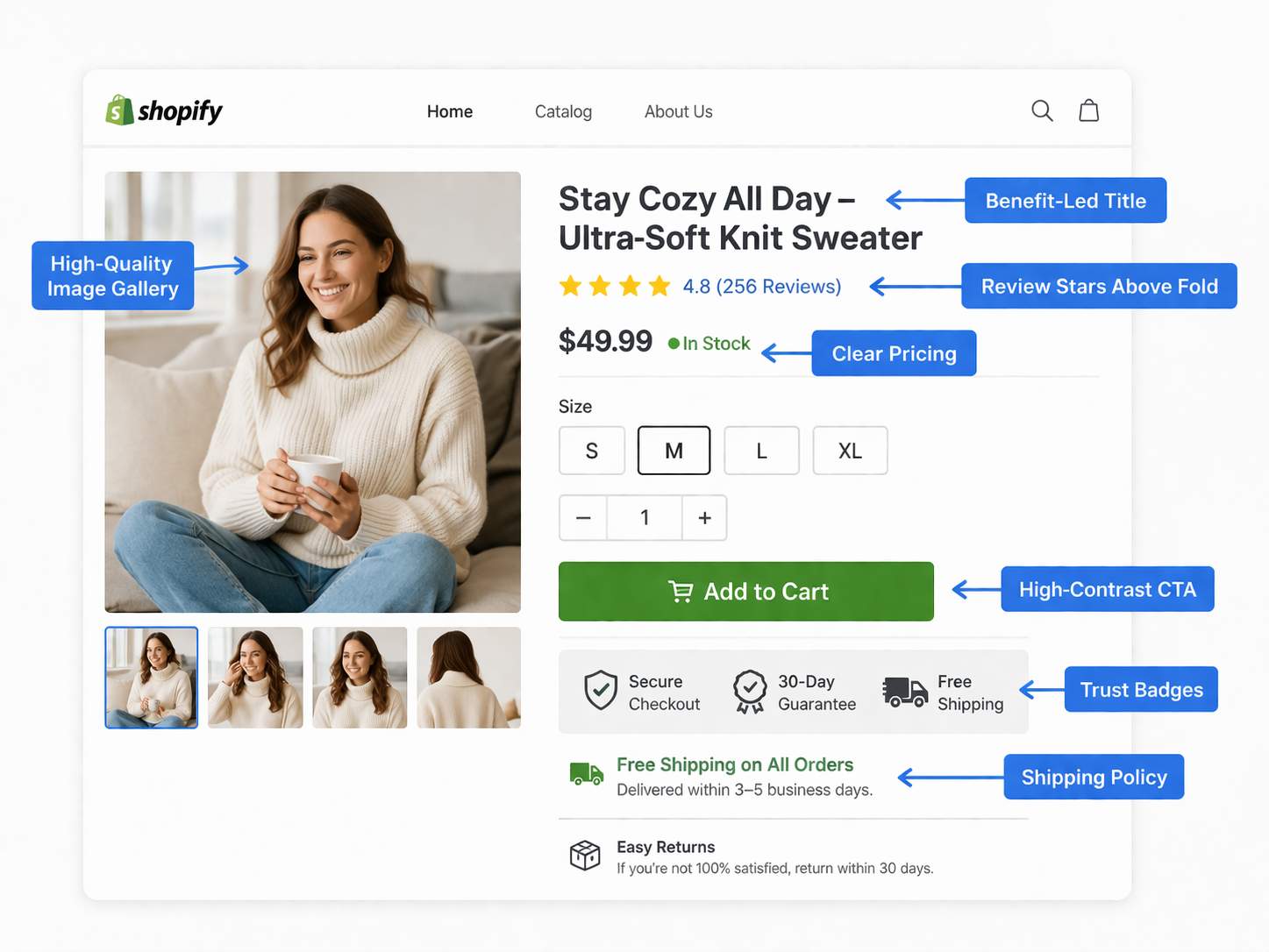
Fix #1: Make Your Images Do the Selling
Images are the single most important element on a Shopify product page. Shoppers cannot touch, smell, or try your product. Images are the closest substitute for a physical retail experience, and most stores underinvest in them.
A high-converting product image gallery includes:
- Multiple angles — front, back, side, and details. Never fewer than four images
- Lifestyle context — at least one image showing the product in use by a real person in a real setting
- Clean hero shot — a crisp, well-lit image on a white or neutral background as the primary photo
- Zoom functionality — product pages without zoom lose shoppers who want to inspect quality
- Video when possible — even a 15-second demonstration video demonstrably increases add-to-cart rates on physical products
- Size or scale reference — for products where size matters, include a reference object or a person for scale
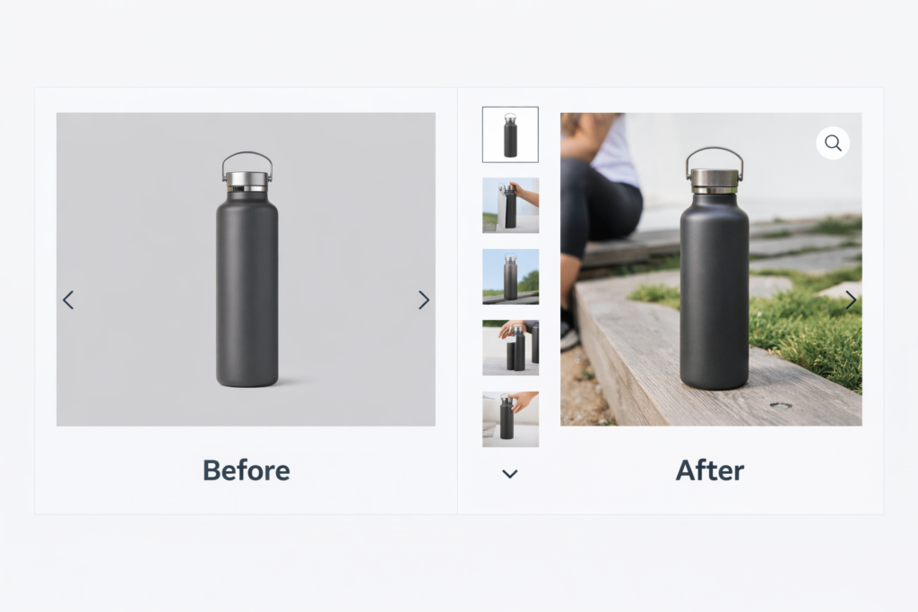
If you only have one or two flat product images, that is your first investment. Better photography has one of the highest returns of any change you can make to a product page.
Fix #2: Write Descriptions That Lead With the Outcome
Most Shopify product descriptions are written for the warehouse, not the buyer. They lead with specs, dimensions, and materials. Buyers do not buy specs — they buy outcomes. They buy the version of their life that includes your product.
Structure your product descriptions like this:
- Lead with the core benefit — one sentence that tells shoppers what this product does for them
- Address the problem — acknowledge the pain point your product solves, specifically
- Deliver the proof — materials, specs, and technical details come here, after the buyer is already interested
- Handle objections — anticipate hesitations (size, durability, compatibility) and answer them in the copy
Keep paragraphs short. Use bullet points for feature lists. Write the way your best customers talk, not the way a manufacturer writes a spec sheet. If you are not sure what language resonates, read your own reviews — your customers are telling you exactly what they valued.
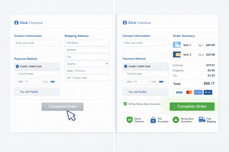
Fix #3: Make Pricing Immediately Legible
Shoppers should never have to wonder what they will pay. Pricing confusion — hidden fees, ambiguous bundles, or prices buried below the fold — creates hesitation that kills conversion. On Shopify, pricing clarity breaks down in several specific ways:
- Compare-at pricing — when you are running a sale, show both the original and discounted price. The visual contrast of a crossed-out price paired with the sale price is one of the most reliable conversion lifts in ecommerce
- Installment payment options — if your product is above $50, display Shop Pay installments or a similar option near the price. Showing “$17.50/mo” next to “$70” removes the price-shock barrier for a meaningful share of buyers
- Volume or bundle pricing — if you offer tiered pricing, show it directly on the product page, not buried in a FAQ
- Currency clarity — if you sell internationally, make currency explicit. Being unclear about USD vs. local currency damages trust
Price is visible above the fold on every well-optimized product page. If a shopper has to scroll to find out what your product costs, fix that immediately.
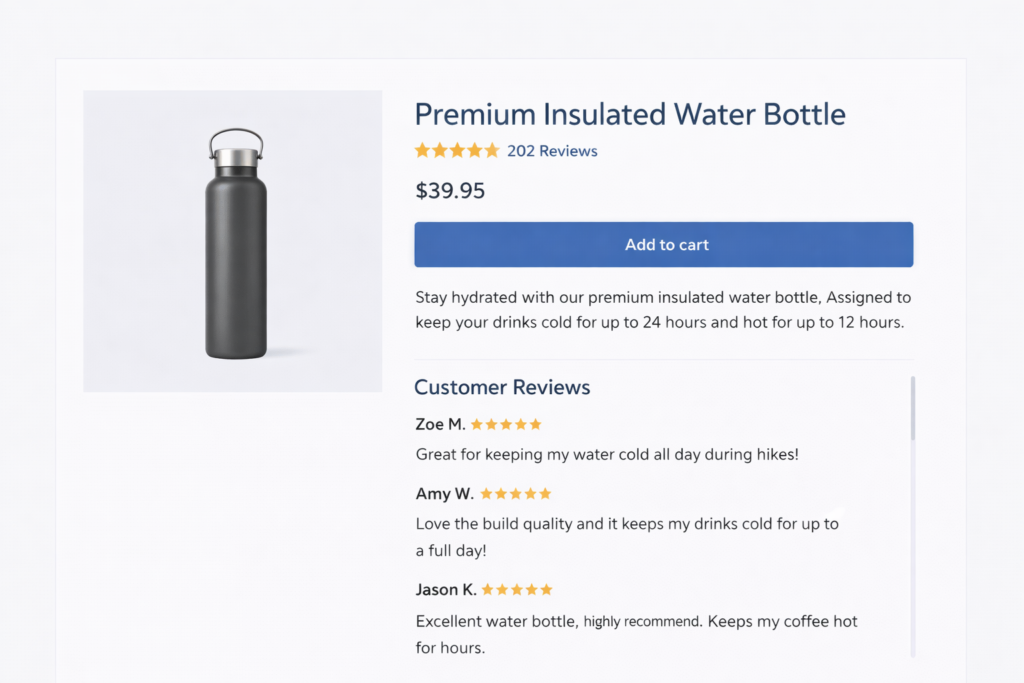
Fix #4: Put Social Proof Above the Fold
Review stars and review counts should appear directly below your product title — not in a tab at the bottom of the page, not accessible only by scrolling, but immediately visible when the page loads. This positioning is one of the most frequently mishandled elements on Shopify product pages.
Why it matters: review stars above the fold serve as a passive trust signal. A shopper who sees 4.8 stars and 312 reviews before they read a single word of copy is already in a different mental state than a shopper who sees none. Social proof reduces the cognitive effort required to make a buying decision.
Beyond placement, the substance of your reviews matters:
- Quantity — more reviews signal more purchasers, which signals less risk
- Recency — reviews from the last 90 days carry more weight than older ones
- Specificity — reviews that mention specific use cases or outcomes are more persuasive than generic five-star ratings
- Response rate — shops that respond to negative reviews demonstrate accountability and often recover the trust damage
If you have fewer than 10 reviews on your top products, a structured email sequence asking recent buyers for feedback is one of the highest-ROI actions you can take right now.
Fix #5: Optimize the Add to Cart Button
The Add to Cart button is the single most important interactive element on a Shopify product page. Every aspect of it — color, size, copy, placement, and visibility — affects whether a shopper presses it. Most Shopify themes get this roughly right. These are the details that separate average from optimized:
- High contrast — the button must stand out from the surrounding page. If your theme is white and your button is grey, that is friction. The button should be the most visually prominent call to action on the page
- Full width on mobile — on a phone screen, a narrow button is a conversion killer. Full-width buttons on mobile are standard for a reason
- Clear copy — “Add to Cart” outperforms “Buy Now” for most product types because it feels lower-commitment. “Buy Now” works better for urgency-driven single-SKU products
- Above the fold — the button should be visible without scrolling on desktop. On mobile, it should either be above the fold or sticky at the bottom of the screen
- State feedback — the button should change visibly when clicked so shoppers know the action registered. An absent or delayed confirmation increases accidental double-purchases and support tickets
Fix #6: Add Trust Signals Near the Buying Action
Shoppers who are ready to buy still carry last-second hesitations about shipping, returns, and payment security. Those hesitations need to be answered in the vicinity of the Add to Cart button — not in a footer, not in a dedicated policy page, but right next to the buying action where the decision is happening.
The trust signals that move conversion on Shopify product pages:
- Shipping timeframe — “Ships in 1-2 business days” or “Free shipping on orders over $50” directly below the button
- Return policy summary — “30-day free returns” is enough. Link to the full policy for shoppers who need it
- Payment security — accepted payment icons (Visa, Mastercard, Apple Pay, Shop Pay) communicate legitimacy, especially to first-time buyers
- Money-back guarantee — if you offer one, say it explicitly near the CTA. This is the single most effective trust signal at the moment of purchase
None of these require extra design work. They are a few lines of copy and a row of icons. The lift they provide is disproportionate to the effort.
Fix #7: Make Variant Selection Clear and Visual
If your product comes in multiple options — sizes, colors, materials, or configurations — the variant selection experience directly affects conversion. Poorly labeled or confusing variant selectors cause shoppers to add the wrong item, return products, and abandon the page entirely when they cannot figure out what they are choosing.
Best practices for Shopify variant selectors:
- Color swatches over dropdowns — visual swatches outperform text dropdowns for color variants because they show the shopper what they are getting instead of making them imagine it
- Selected state clarity — the currently selected variant should be visually distinct. No ambiguity about what is in the cart
- Out-of-stock signals — unavailable variants should be visually marked rather than hidden. Hidden variants create confusion about what the store carries
- Size guides linked from the selector — for apparel or footwear, a linked size guide directly adjacent to the size selector reduces returns and hesitation from shoppers who are unsure
- Image swap on selection — when a shopper selects a color variant, the main product image should update to show that color. If your theme does not do this by default, it is worth fixing
Fix #8: Speed Up the Product Page Specifically
Overall store speed matters, but product page speed is the most conversion-critical because it is where buyers make their decision. A slow product page costs you sales directly. A slow collection page costs you browsing time. The stakes are different.
The most common product page speed problems on Shopify:
- Unoptimized hero images — the main product image is often the largest file on the page. It should be compressed, properly sized, and served in WebP format
- Third-party review app scripts — review apps like Loox, Judge.me, and Yotpo add JavaScript that can block rendering. Check whether your app loads synchronously and whether lazy loading is available
- Upsell and cross-sell app bloat — frequently bought together, related products, and post-purchase upsell apps all add load to the product page. Audit whether each one is earning its weight
- Video embeds without lazy loading — embedding a YouTube or Vimeo video without lazy loading adds significant page weight even when no one plays it
Use our free website speed test to get a real-time score for your product pages. If you need hands-on help resolving Shopify performance issues, our Shopify development team can identify and fix the specific bottlenecks on your store.
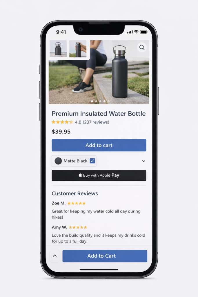
Fix #9: Optimize Your Product Pages for Mobile First
More than 70% of Shopify traffic comes from mobile. But most Shopify themes are still built desktop-first, with mobile treatment applied as an afterthought. A product page that works well on desktop is not automatically acceptable on mobile. The two experiences require different decisions.
The mobile product page fixes that move conversion:
- Sticky Add to Cart — a button that follows the shopper as they scroll through images and descriptions is the highest-impact single change for mobile product page conversion
- Swipeable image gallery — mobile shoppers swipe through images. If your gallery requires tapping arrows, you are adding friction
- Collapsed product information — on mobile, long descriptions and specifications should start collapsed with a “Read more” toggle so the CTA stays within reach
- Accelerated checkout buttons — Shop Pay, Apple Pay, and Google Pay buttons on the product page allow mobile shoppers to complete purchase in a few taps without filling out forms. This is one of the most powerful mobile conversion tools available on Shopify
- Tap-friendly variant selectors — size and color selectors need to be large enough to tap accurately. Tiny variant buttons on mobile create mis-selections and frustration
Test your product pages on a real mobile device, not a browser emulator. The experience is materially different, and problems that are invisible on desktop simulator are immediately obvious on an actual phone.
Fix #10: Use Urgency and Scarcity Honestly
Urgency and scarcity signals — low inventory warnings, shipping cutoff timers, sale expiration countdowns — increase conversion when they are real. They damage trust when they are fabricated. The distinction matters more now than it ever has, because shoppers are increasingly sophisticated about fake urgency.
Urgency signals that work without eroding trust:
- Genuine low stock — “Only 4 left in stock” when inventory is actually that low. Shopify can display this automatically from real inventory data
- Real shipping cutoffs — “Order within 3 hours for same-day dispatch” when that is operationally true. Link it to the actual warehouse cutoff time
- Time-limited sales that actually end — if your sale countdown resets every time it expires, shoppers notice. Run real limited-time promotions and let them end
- Restock notifications — on out-of-stock items, an email notification opt-in both captures leads and signals that the product has demand worth waiting for
Real scarcity converts better than fake scarcity in the long run because it does not train shoppers to ignore your signals.
How to Prioritize These Fixes on Your Store
You do not need to implement all ten optimizations at once. Start with your highest-traffic product pages — the ones getting the most visitors with the lowest add-to-cart rate. Those pages have the most to gain from improvement.
Work through the fixes in order of effort and impact:
- Quick wins (under an hour each): trust signals near the CTA, review placement, pricing clarity, button contrast
- Medium effort (a day or less): product descriptions, variant selectors, mobile CTA, urgency signals
- Bigger investments: photography, video, speed optimization
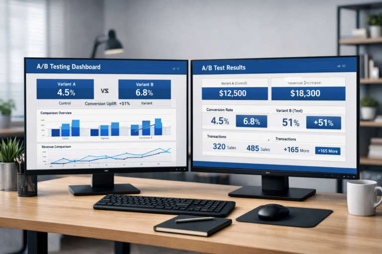
After implementing a change, give it at least two weeks of traffic before judging results. If you are running enough traffic to reach statistical significance faster, use A/B testing to measure impact with confidence rather than attributing any week-over-week change to your most recent edit.
Product page optimization is not a one-time project. Your top pages should be reviewed quarterly. Shopper behavior shifts, competitive context changes, and the fixes that worked last year may not be the most leveraged ones today.
If you are not sure where your product pages are losing buyers, a structured audit is the fastest way to find out. Your checkout and cart abandonment rate are downstream effects of product page performance — fixing the source changes everything that follows.
Get a Free Shopify Product Page Audit
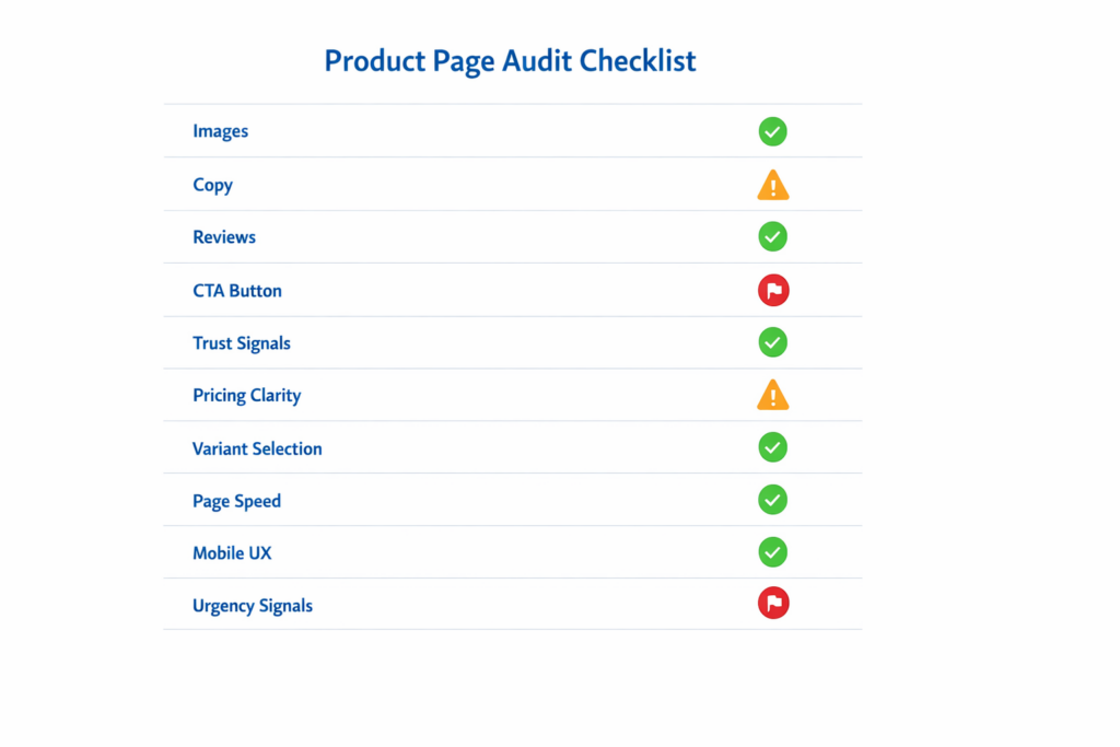
Site OptimizR audits Shopify product pages for the exact friction points described in this guide — images, copy, social proof, trust signals, speed, and mobile experience. The audit is free, takes about 48 hours, and gives you a prioritized list of the specific changes most likely to increase your conversion rate.