Free conversion audit
Get a tailored action plan based on your current funnel.
Your WooCommerce Checkout Is the Most Expensive Page on Your Site
Most ecommerce businesses treat traffic as the problem. More ads, more SEO, more social — all pointed at a checkout that quietly loses a third or more of the buyers who actually get there. WooCommerce checkout optimization focuses on the opposite end of that equation: converting the traffic you already paid to acquire.
The default WooCommerce checkout is built for flexibility, not performance. It works. It processes orders. But it is not optimized for the moment when a buyer is on the edge of completing a purchase — distracted, uncertain, and looking for a reason to leave. Every unnecessary field, every missing trust signal, and every slow-loading element gives them one.
This guide covers the eight highest-impact checkout fixes, in the order they tend to move the most revenue, along with how to test whether each one is actually working for your specific store.
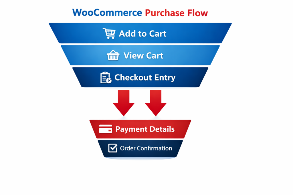
Where the Default WooCommerce Checkout Loses Customers
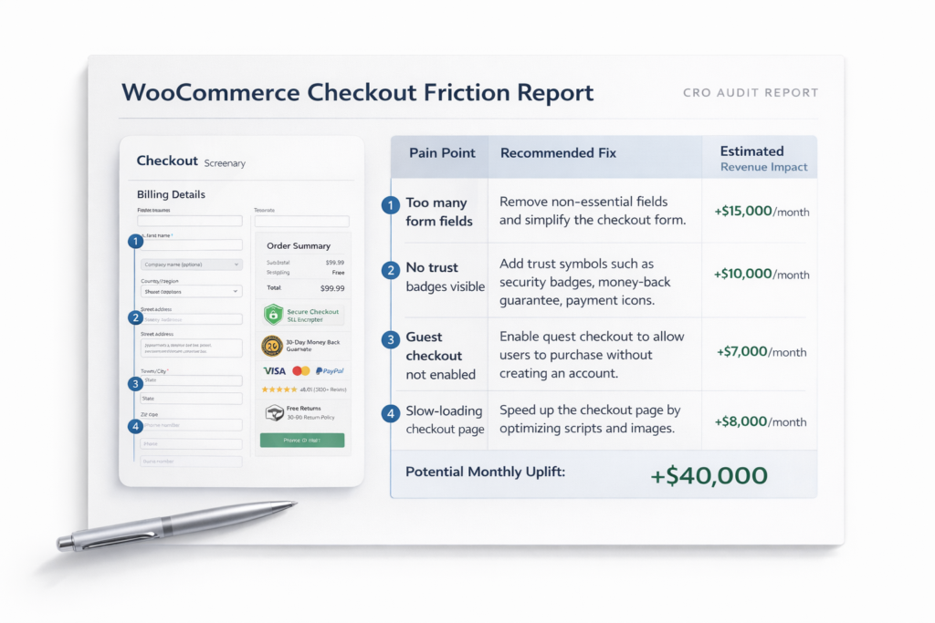
WooCommerce ships with a two-column checkout form that asks for billing address, shipping address, account creation, and order notes — even when your business does not need half of those fields. For a physical product business shipping to one address, the default setup creates redundant inputs, optional fields that feel required, and cognitive load that pushes buyers toward the back button.
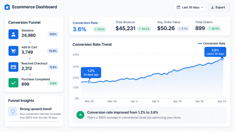
The numbers reflect this. Average ecommerce cart abandonment sits between 65% and 75% industry-wide. For stores with bloated or confusing checkout flows, it runs higher. A significant portion of that abandonment happens not because the buyer changed their mind about the product — but because the checkout experience introduced enough friction to break the purchase intent they arrived with.
The good news: most of those friction points are fixable without a developer or a platform migration. If you are also managing a Shopify store, the same principles apply — see our breakdown on Shopify checkout optimization for a platform-specific comparison. The problems are often the same. The implementation differs.
That is a structural problem, not a traffic problem.
Fix 1: Cut the Checkout Fields to What You Actually Need
The single most impactful WooCommerce checkout page optimization most stores are not doing is field reduction. Every field you add to a checkout form is a micro-decision the buyer has to make. Micro-decisions accumulate into resistance. Resistance becomes abandonment.
Start by auditing which fields are actually required to fulfill the order. Most stores can remove or hide:
- Company name — irrelevant for most B2C transactions
- Address line 2 — useful for a small percentage of buyers, creates noise for everyone else
- Order notes — unless your fulfillment process depends on it, remove it
- Phone number — if you do not call or SMS customers, this is friction with no upside
- Account creation prompt — covered in the next section
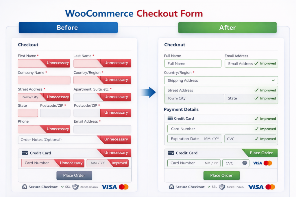
WooCommerce allows you to mark fields as optional, hidden, or required via the Checkout settings or with a lightweight plugin. The goal is to reach a form where every visible field has a direct reason to be there. If a field does not affect shipping, billing, or communication, it should not be in the checkout flow.
As a benchmark, best-performing checkout flows for physical products typically contain six to eight fields. If yours has more than twelve, start trimming before doing anything else.
Fix 2: Enable Guest Checkout — Without Burying It
Account creation is one of the top-cited reasons buyers abandon checkout. Requiring an account before purchase is a conversion-killer that predates WooCommerce — but it persists across stores because it feels like the right default for retention.
It is not. Most buyers who do not already have an account on your store will not create one mid-purchase. The correct approach is:
- Enable guest checkout unconditionally in WooCommerce → Settings → Accounts and Privacy.
- Make guest checkout the default path — the prominent option, not the secondary one.
- Offer account creation post-purchase, after the order is confirmed, when the buyer is already satisfied.
Post-purchase account creation converts significantly better than pre-purchase prompts. The buyer has already committed and placed their trust in your store. At that point, the account offer feels like a convenience (“save your details for next time”) rather than a gate.
If account data is important to your business, you keep it — you just move the ask to after the transaction is complete.
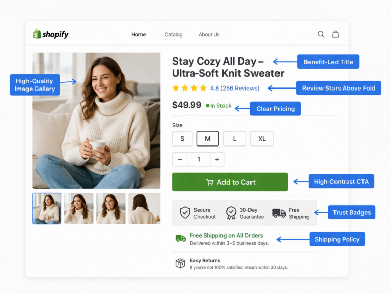
Fix 3: Add Trust Signals at the Checkout Step
Checkout is where purchase anxiety peaks. The buyer is about to enter payment information, commit to a specific product, and trust that the order will arrive as described. Any uncertainty at this stage is abandonment risk.
Trust signals address that uncertainty directly. The most effective ones at the checkout step include:
- SSL and secure payment badges — confirm the transaction is encrypted and safe
- Money-back guarantee or return policy — reduce perceived risk at the moment of commitment
- Payment method icons — visual confirmation that the buyer’s preferred method is accepted
- Review count or aggregate rating — social proof at the decision point
- Estimated delivery date — removes uncertainty about when the product arrives
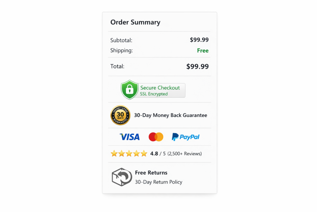
These do not need to be prominent. A trust badge row beneath the order summary or a one-line guarantee near the place order button are enough to reduce hesitation without cluttering the form. The placement matters as much as the presence — put them adjacent to the payment and CTA sections, where anxiety is highest.
If your store has a low conversion rate that has not responded to other changes, missing trust signals at checkout are frequently the cause — especially for stores selling higher-priced products to first-time buyers.
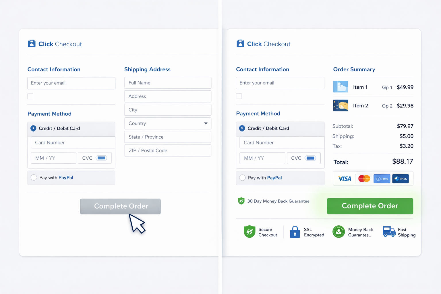
Fix 4: Switch to a One-Page Checkout Layout
The default WooCommerce checkout is a single page, but it does not always feel like one — especially on mobile, where the form stacks vertically and the place order button is buried below the fold. Multi-step checkout plugins solve this by breaking the process into named stages (Contact → Shipping → Payment → Review), which reduces perceived complexity even when the total number of fields stays the same.
Whether one-page or multi-step performs better depends on your product type, price point, and buyer profile. There is no universal answer. But the layout decisions that consistently affect performance are:
- Progress indicator — shows buyers where they are and how close they are to done
- Persistent order summary — keeps the product and price visible throughout so buyers do not second-guess what they ordered
- Mobile-first field sizing — inputs large enough to tap accurately, no zooming required
- Auto-fill compatibility — form fields structured so browser and device autofill works correctly
Plugins like Fluid Checkout for WooCommerce or FunnelKit Checkout give you layout control without breaking the core WooCommerce data model. Before installing, cross-reference their compatibility with your payment gateway — some gateways inject their own checkout fields and do not play well with checkout overrides.
Fix 5: Fix Checkout Page Speed
Checkout pages are often slower than the rest of a WooCommerce site because they load payment gateway scripts, security tokens, and dynamic cart data on every visit. A checkout that takes more than three seconds to load on mobile loses a measurable percentage of buyers before the form even renders.
The most common speed issues at checkout:
- Unoptimized payment gateway scripts — Stripe, PayPal, and others inject external JavaScript that blocks rendering
- No server-side caching bypass — checkout pages should be excluded from page caching (most caching plugins do this, but confirm your setup)
- Uncompressed images in the order summary — even small product thumbnails should be WebP and properly sized
- Plugin bloat — every active WooCommerce plugin adds overhead; checkout-specific plugins with poor code quality compound this
Use our website speed test or Google PageSpeed Insights to benchmark your checkout URL specifically — not just your homepage. Checkout pages regularly score 20 to 30 points lower than the rest of a site because they are excluded from caching and carry heavier dynamic loads. Fixing the bottlenecks on this page specifically tends to have an outsized impact on mobile conversion rate, where every additional second of load time compounds abandonment.
Fix 6: Reduce Friction at Payment Selection
Payment method presentation affects conversion more than most store owners realize. Buyers who see their preferred payment method immediately are less likely to abandon. Those who have to scroll, search, or figure out which option applies to them are not.
Key optimizations at the payment step:
- Show the most common method first — credit/debit card for most stores, PayPal or buy-now-pay-later if your analytics show heavy usage
- Add express checkout options above the form — Shop Pay, Apple Pay, Google Pay, and PayPal Express reduce the checkout to a single click for buyers already authenticated in those systems
- Remove payment methods your buyers do not use — offering 8 options creates choice paralysis; 3 to 4 well-chosen options outperform a comprehensive list
- Display card type icons — visual confirmation that Visa, Mastercard, and Amex are accepted reduces hesitation
Express checkout buttons are consistently among the highest-converting elements you can add to a WooCommerce checkout. For mobile buyers in particular, skipping the card entry form entirely and completing the purchase with Face ID or a saved wallet removes the single largest friction point in the flow.
Fix 7: Handle Checkout Abandonment Before It Becomes a Lost Sale
Even an optimized checkout will not convert 100% of buyers. Some will get distracted, get interrupted, or lose their internet connection mid-form. Recovering those buyers is a separate lever from optimizing the checkout itself — but it compounds the impact of everything above.
The most effective recovery mechanisms for WooCommerce:
- Abandoned cart emails — triggered when an email address is captured at checkout but the order is not completed. First email within one hour, follow-up within 24 hours. This recovers 5% to 15% of abandoned carts depending on the product and offer.
- Exit-intent overlays — triggered when cursor movement suggests the buyer is about to leave. Best used with a meaningful incentive (free shipping, discount, deadline) rather than a generic “wait, don’t go” message.
- Persistent cart — WooCommerce carts expire by default. A plugin that extends cart persistence to 30 days means buyers who return from a different device or session find their cart intact.
For a full breakdown of abandonment recovery strategy, the principles in our cart abandonment rate guide apply equally to WooCommerce — the tactics are platform-specific but the framework is the same.
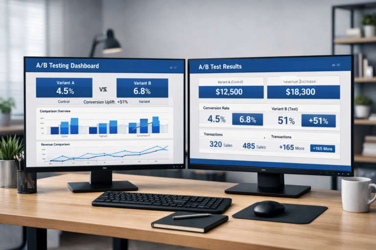
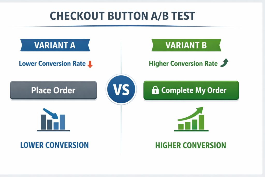
Fix 8: A/B Test Your Checkout — Even Small Changes Move Conversions
The fixes above are the highest-confidence starting points based on cross-store patterns. But your checkout converts against your specific buyers, your specific products, and your specific price points. What works universally is a starting hypothesis — not a guaranteed outcome.
A/B testing your checkout means running controlled experiments where some buyers see the current version and others see the variant, and measuring which produces more completed orders. The elements most worth testing at checkout:
- CTA button copy — “Place Order” vs. “Complete My Order” vs. “Confirm and Pay” regularly produces 5% to 15% conversion differences
- CTA button color and size — contrast and visual weight matter, particularly on mobile
- Trust badge placement — adjacent to the CTA vs. in the order summary vs. at the top of the form
- Guest checkout positioning — default selected vs. account creation as default
- Headline and subheadline above the form — a reassurance message (“Secure checkout — takes less than 2 minutes”) can lift completion rate without changing any form fields
- Form layout — single column vs. two column vs. stepped layout
If you are running tests without enough traffic to reach statistical significance quickly, prioritize the CTA and trust signal experiments first — they require the least traffic to detect a real difference and they affect every single buyer who reaches the checkout step. Working with an A/B testing agency can accelerate the research and testing cycle significantly, particularly if you do not have a dedicated CRO analyst in-house.
Not sure how long your tests need to run to be reliable? Use our A/B test duration calculator to find the minimum runtime based on your traffic and baseline conversion rate before calling a winner.
How Site OptimizR Approaches WooCommerce Checkout Optimization
When we audit a WooCommerce checkout, we do not start with a plugin recommendation. We start with data. Session recordings, form analytics, and funnel analysis tell us exactly where buyers are stopping — whether it is the account creation prompt, a specific field, a slow payment step, or a missing trust signal that would have answered the one question holding them back.
From that research, we build a prioritized list of fixes ranked by estimated revenue impact. The highest-confidence changes go first — field reduction, guest checkout, trust signals — and we instrument every change to measure actual conversion impact, not just engagement signals.
The goal is to look at your checkout the way a buyer does: at the moment when they have decided to buy but have not committed yet. Every element that introduces uncertainty, delay, or effort at that moment is a candidate to remove or improve. Over time, a well-optimized WooCommerce checkout compounds — higher conversion rate, lower cost per acquisition on paid ads, and more revenue from the same traffic.
Want to model the revenue impact before you start? Use our CRO ROI calculator to estimate what a 1% lift in checkout conversion rate is worth for your store based on your actual traffic and average order value.
If your current checkout has not been systematically reviewed against these criteria, there is almost certainly a gap. For most stores, the first pass through these eight fixes produces a meaningful lift within the first 30 days.
Get a Free Checkout Audit for Your WooCommerce Store
Before you install a plugin or change a single form field, get clarity on where your checkout is actually losing buyers. A focused audit identifies the specific friction points costing you orders, ranks them by revenue impact, and gives you a prioritized fix list — so you know what to change first and why.
Site OptimizR offers a free CRO audit that includes a full checkout review: field analysis, trust signal gaps, mobile usability, and page speed — plus a prioritized list of experiment recommendations based on your store’s data, not generic best practices.
Get your free checkout audit and find out exactly where your WooCommerce store is leaving revenue on the table.